Fratello On Air: The Power Of Fonts On Watches
At long last, Fratello On Air has decided to address a request from one of our faithful listeners. The topic of fonts on watches has come up as a suggested topic many times. Does it sound mundane? Perhaps, but that couldn’t be further from the truth. Our watch content begins after 15 minutes.
Fonts are a characteristic of most watches that we rarely consider. Nevertheless, they are a detail that if chosen or executed badly can ruin a watch. Today, we discuss the power of typefaces/fonts and why it matters. We praise the brands that spend time making fantastic design choices and throw a few tomatoes at missed opportunities.
Handgelenkskontrolle
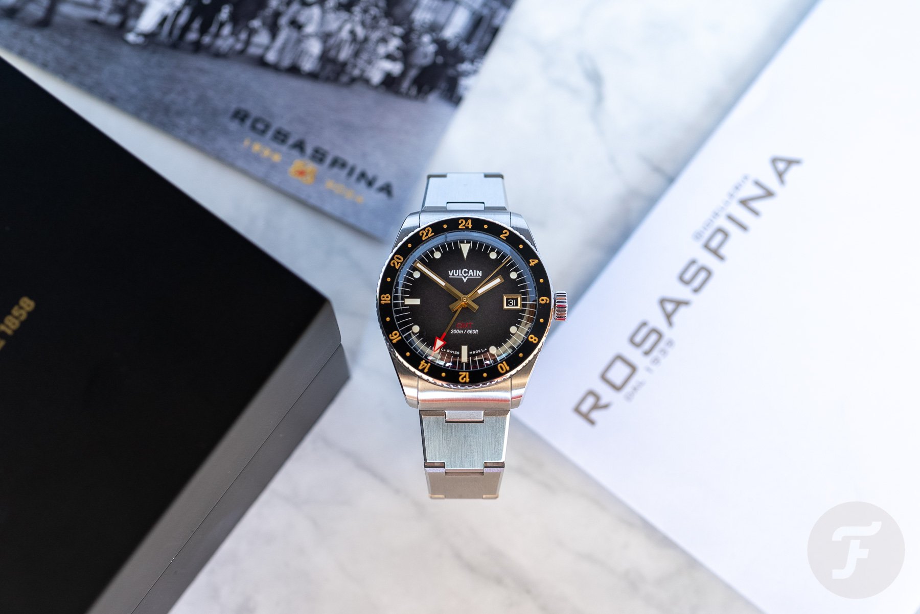
Before we get to fonts, we open our episode with some discussion on the differences between saying “half past the hour” in Germany and England. In fact, they translate to the same words but mean very different things! Then, as we recorded this episode on the 4th of July, we brought up a gift that arrived earlier that morning from America. The Yeti Tundra 45 Patriotic Limited Edition landed in the UK. For the Handgelenkskontrolle, Balazs is wearing the Vulcain Rosaspina GMT, a limited edition of 85 pieces available on the Bergamo-based jeweler’s website. Mike is wearing another Borgel-cased Movado reference 18127 from the ’50s.
Fonts on watches
Saku, a faithful and committed listener from Finland, has asked us multiple times to discuss fonts on watches. Other topics have taken priority, and, honestly, we were concerned about the ability to fill a show with the subject. We were wrong to worry, though, because we had plenty to discuss. We begin the chat with academic research from Balazs and his contact, @danova from Instagram. This sets the stage for subtopics, including our favorite mixed uses of font on a dial, best logos, and our least favorite examples. We mention the following watches and articles:
- The Rolex Submariner 5512 and 5513
- The Seiko J13035, J13040, and J13043
- Thomas’s article on building a watch brand, Episode 8
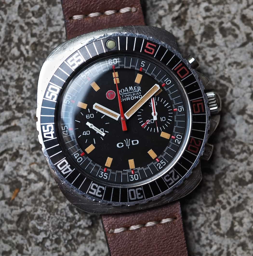
- Our logo discussion mentions Eterna, Tissot, the Roamer Stingray, and Doxa’s new and old fonts
- Excelsior Park’s number designs
- Our least favorites include the modern Patek Philippe logo, the Tissot Heritage 1938, and the Blancpain Fifty-Fathoms 70th Anniversary Act 1, Series II
Thank you for the suggestion, Saku, and we hope all of you enjoy the episode! If you have any ideas for future shows, please send your suggestions.


