Chronographs I’d Like To See Made — From Über-Useful To Useless
The chronograph is intended to do one thing and do it well — measure elapsed time. Depending on the watch, only a certain amount of unbroken time can be measured (60 minutes, 12 hours, etc.). However, chronographs do the job adequately, despite their design limitations. My issue is that it’s all a little…humdrum. Cluttered dials, limited measuring capacity, and an earnest emphasis on the usefulness of chronographs have left the genre feeling anachronistic. It’s the 21st century (and has been for a while). I want to see some chronos that defy expectations.
I’ve recently been on a bit of a chronograph love trip. From the Fratello × Nivada Grenchen Racing Chronograph to my recent review of the Bravur Grand Tour series, chronographs have been on my radar more than usual. And yet, I haven’t been able to bring myself to buy (another) one. What gives?
Well, for starters, I have a couple already. One, a gift from my father, is probably staying in my collection for the long haul. Another, a Seiko SNA411 Flightmaster (which I already wrote loving about), may soon be finding a new home on my quest to downsize my collection. Arguably, that could be an excuse to get another one. While I’ve flirted with purchasing a nice Swiss chronograph since the beginning of my watch journey, the chronographs I’m interested in just haven’t been made yet.
Chronographs = classic
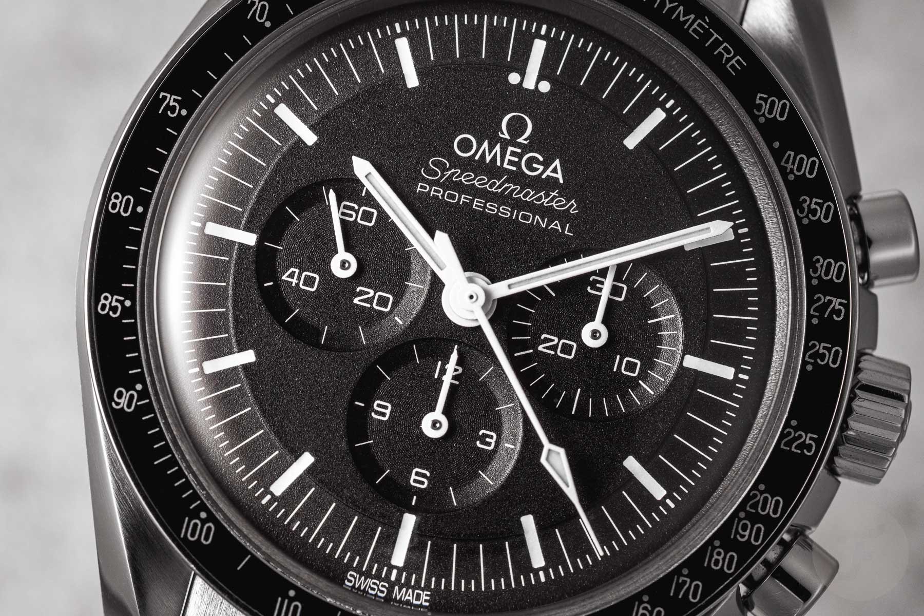
My first serious foray into watches was stumbling across the Omega Speedmaster Professional Moonwatch. Perhaps the chronograph, its incredible history and marketing cause it to reign supreme in the hearts and minds of many watch collectors. Initially, I came across it online while working a job in a remote, rural area with not much to do in the evenings except digitally window shop. I was immediately hooked. Biding my time, I eventually got to a boutique in the city and tried one on in the metal. On the wrist, I was still impressed. It is a handsome watch. But divorced from all of its press photography and copy, it wore simply as a nice black tool watch. Is the Moonwatch Professional an excellent watch? Absolutely. I just found it isn’t for me.
So began a casual search for the chronograph that is for me. And, while I’ve come across many excellent examples, nothing has captured me enough to be the chronograph
Austere and complex
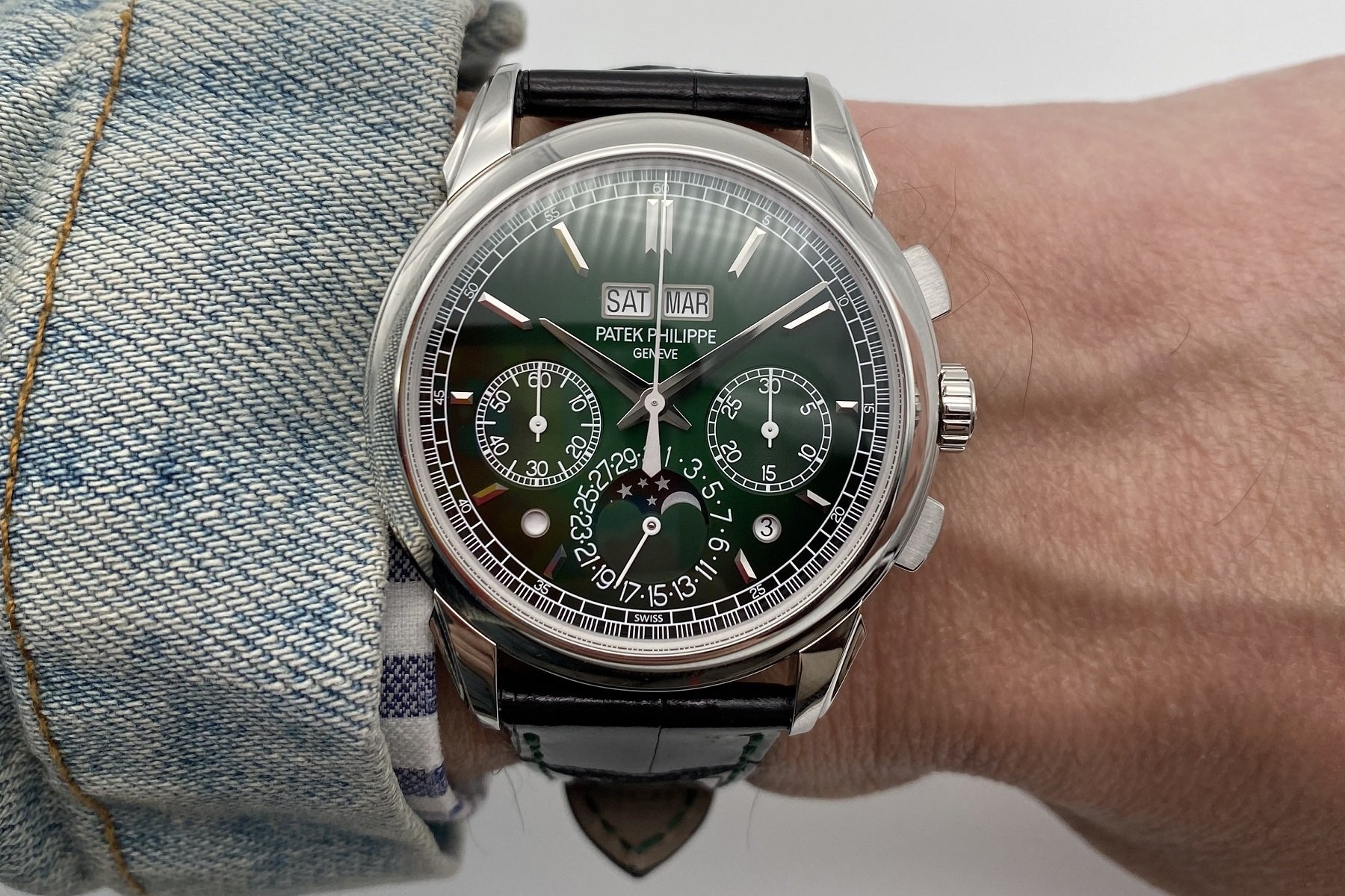
Most chronographs follow the same design checklist — sub-dials, simple hands, and lots of printed marks. For maximum legibility, these elements are almost a must. If they fall into the more tool-watch category, they usually incorporate high contrast and low ornamentation. Packing not only the hours, minutes, and seconds of the watch but an additional set for a 12-hour chronograph into a 38mm circular window is no small feat. It’s no wonder that the tri-register design has been adopted by so many. Of course, that’s not to mention the limitations imposed by standardly available chronograph movements. As you add more complexity, such as day-dates, slide rules, or even full perpetual calendars and moonphase indicators, legibility drops from reading your watch at a glance to “hold on a minute.” The fallacy is that, as a rule, chronographs need to be legible.
The present time
If watches in the present day are deemed functionally obsolete, what does that say about the chronograph? For the daily timing needs of most watch wearers, a diver’s bezel is more appropriate and useful than a 12-hour chronograph. For regular chronograph wearers, when was the last time you thought, “Thank God I had the ability to measure up to twelve hours on my wrist!”? Not yesterday, and I bet you won’t think it tomorrow. Is that a reason to discard and slander the faithful chronograph? Absolutely not. If anecdotal evidence is worth anything, the popularity of chronographs is currently high despite their, erm, inherent uselessness.
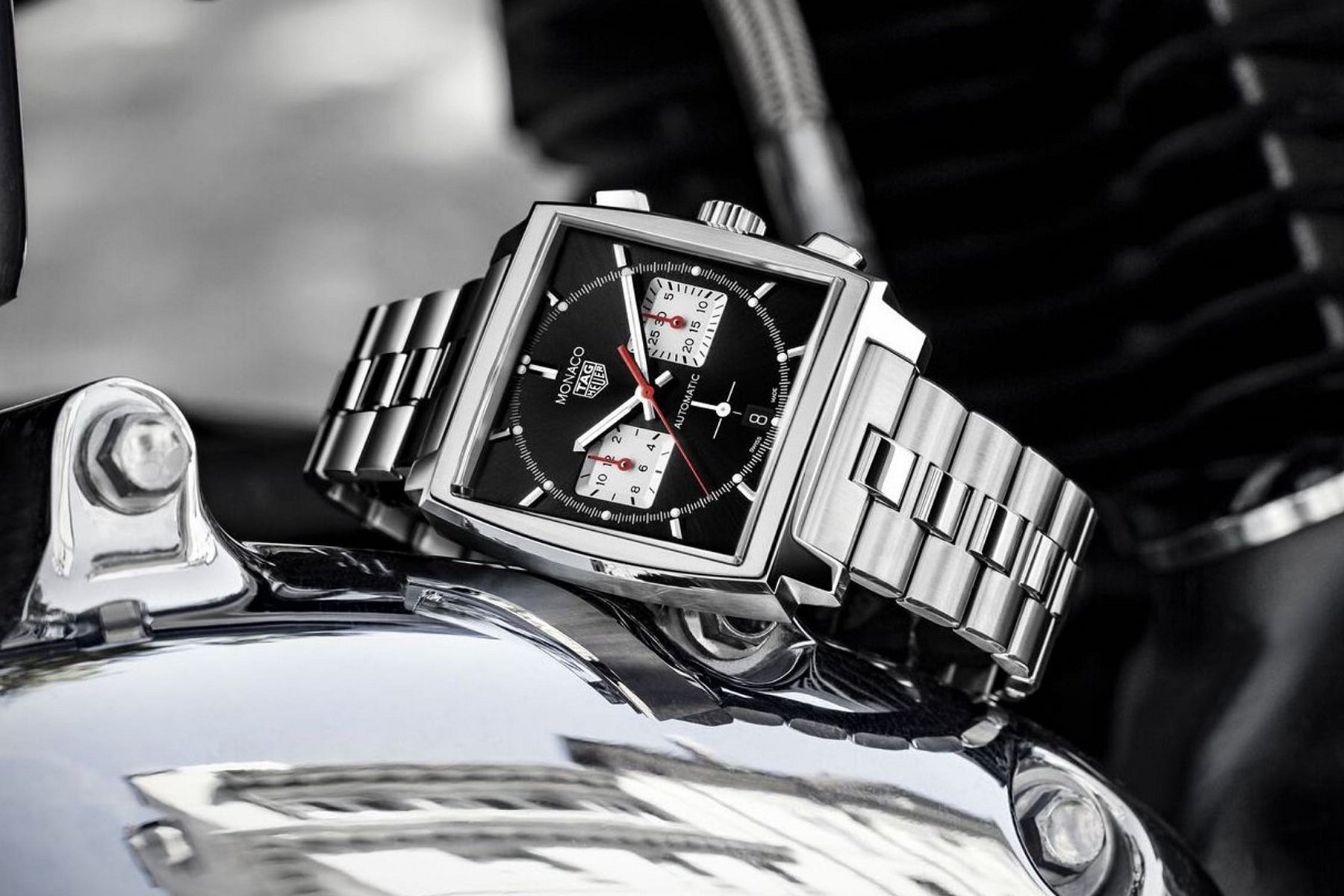
And yet, most watch companies keep churning out chronographs that take themselves very seriously. This chronograph can go to the Moon. That chronograph is for race car drivers. That’s all fine and good, and it’s a special thing to buy into the history and capability that many of the prominent chronographs cut their teeth on. But I’m not going to the Moon. And I’m loathe to own and wear a watch that takes itself more seriously than I take myself.
Still, chronographs are fun regardless of how austere some manifest. Pushing buttons, causing internal gears to start and stop, all against the backdrop of the constant march of time… It feels almost as if we can have a hand in controlling time ourselves. So I say, yes, let’s celebrate chronographs and all that they do. But we don’t have to stay stuck in 1969.
Independently fun chronographs
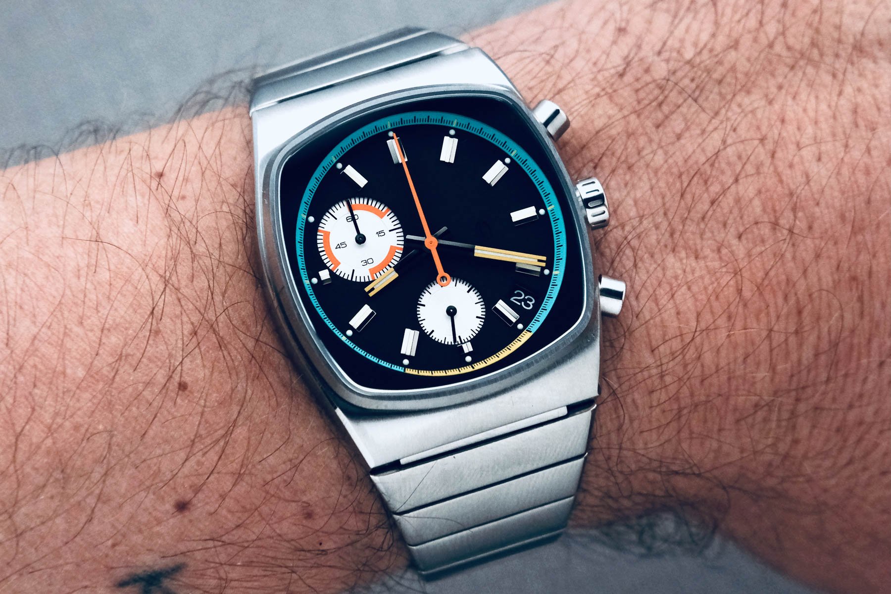
Some brands know this already. Brew, the small independent producing watches for coffee lovers, makes 60-minute chronographs with markings to indicate the window of time for pulling a perfect espresso shot. (It’s 25–35 seconds, per Brew and my experience as a barista.) Now that’s a useful chronograph for this century while cranking up the “fun” quotient of many units. It also is a great way to annoy the living hell out of your local baristas.
Do the watches look good? Absolutely. Brew has effectively captured the “circly-square” television screen of the 1970s in watches clearly meant for today. There’s nothing austere about them. Have your coffee cake and eat it too.
Fortis = fun?
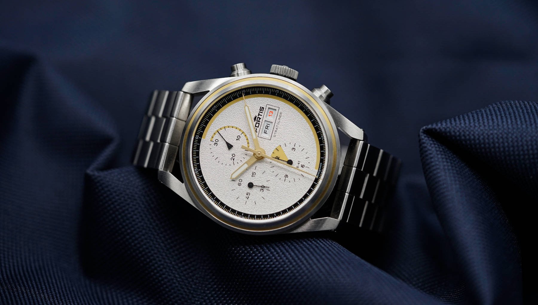
Fortis, an independent tool-watch maker famed for long being the official watch supplier of ROSCOSMOS, not too long ago departed the shores of austerity into the uncharted territory of fun. With Jupp Philipp at the helm, Fortis’s Stratoliner chronograph series is still seriously intended for space but without the pomp and circumstance. Like the concept cars we wish would come to market as is but never do, the Stratoliner chronographs present like a designer’s finished renderings before the suits tame them down.
Similar to Brew, Fortis uses special markings on the dial and sub-dials to capture the pivotal moments of a civilian space flight. However, for a 12-hour chronograph, the design is cool and clean with no clutter about it. This, in part, is because Fortis did away with hour markers entirely. Is that also the biggest criticism I’ve read about the watches? Yes. But I posit that there are other, more “professional” space watches for those who want tradition. Fortis isn’t trying to use watches to time life-saving rocket fuel burns in the stratosphere. It’s trying to make the chronograph fun.
Not fun enough
And I’d say for everything that Brew, Fortis, and other independent brands are doing to bring levity to chronographs is still not quite far enough. Why? Because, unfortunately, these watch companies are still creating some pertinent use for the chronograph function itself. Time a perfect espresso shot. Time your trip to space. The point is being missed somewhere that someone or something else is making our espresso without our input and space tourism is a lot more enjoyable while looking out a porthole than at a dial.
I propose that, with all their sub-dials and buttons, chronographs could be and should be wonderfully frivolous. Think what one could do if sub-dials and a central chronograph second’s hand weren’t used for measuring elapsed time but, say, animating a dial. There’s no reason we can’t lean into the uselessness of chronographs and really have some fun with it.
If we’re already openly embracing that wristwatches are inherently useless and chronographs even more so, isn’t it about time we had some fun?
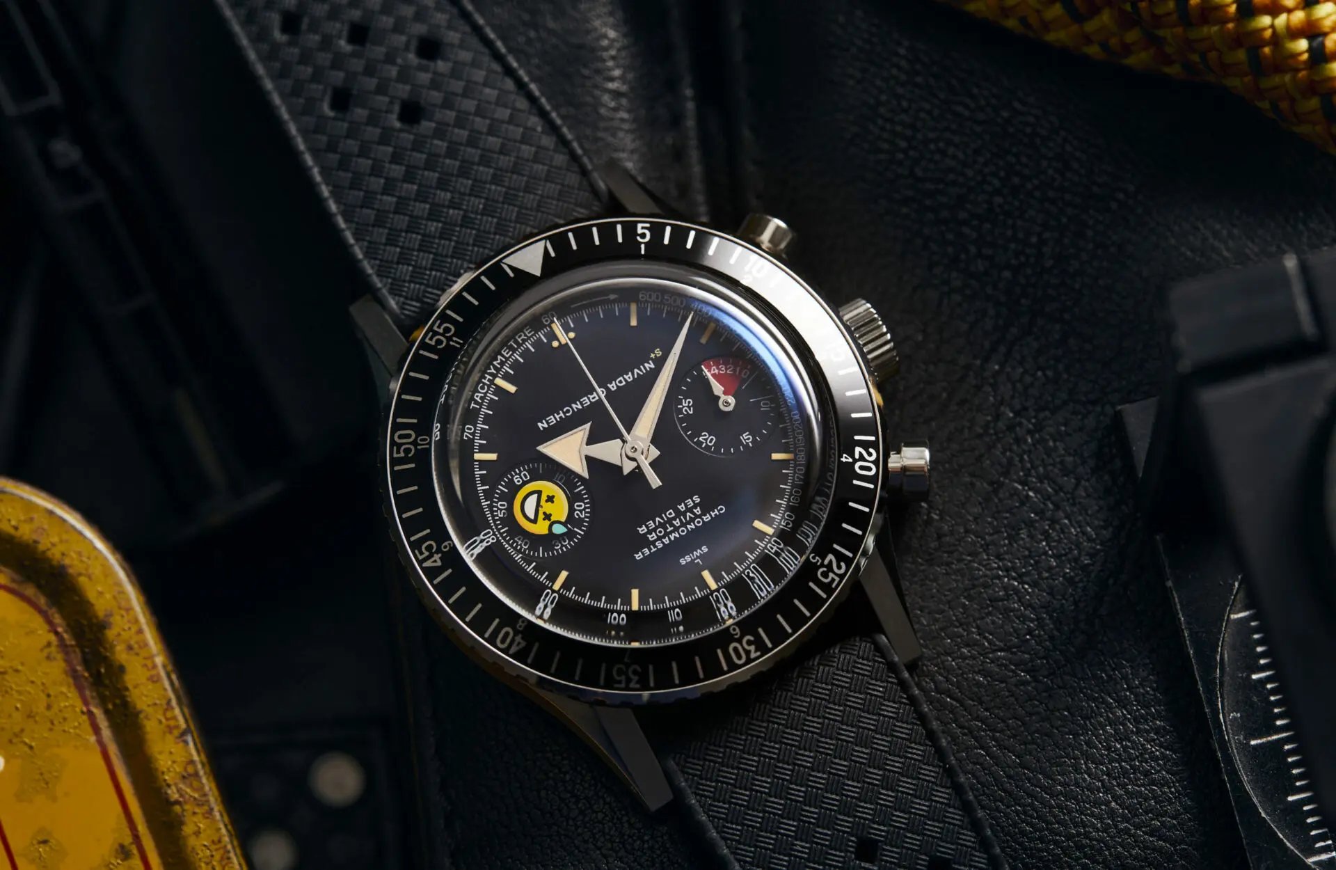
Time+Tide’s three-way collaboration with Nivada Grenchen and seconde/seconde/ dipped the proverbial toe into the waters of what I’m talking about. Featuring a base watch of Nivada’s Chronomaster, here dubbed the “ChaosMaster,” the running seconds hand in the 9 o’clock sub-dial is replaced with a yellow emoji face. It spins constantly, indicating the watch is ticking and does little else — except for perhaps manufacturing joy and poking fun at the seriousness that is the tool chronograph.
Now imagine if every element of the chronograph were replaced with something artsy and playful, like something by Mr Jones Watches to the nth degree. Speaking of that, MJW, where’s our “perfectly useless afternoon” chronograph? If we’re already openly embracing that wristwatches are inherently useless and chronographs even more so, isn’t it about time we had some fun?
Counterpoint: serious chronographs for the 21st century
If the above proposal doesn’t convince you and capture your imagination, I can only assume you are a more somber, traditional person who doesn’t much appreciate a “go fast, break things” approach to watch design. Not to worry. I have a pitch for you too.
Chronographs are obsolete — fine, yes. But that doesn’t mean that they can’t evolve. And I’m sorry, but the 12- or even 24-hour chronograph is so last century. For all the complication that goes into some Haute Horlogerie watches, I’m surprised that, regarding chronographs, the best that most brands can produce is the split-second rattrapante. Yes, that’s an additional level of complexity to increase the overall allure of a piece of unobtanium, but for owners that have no use for the function, well, see my above point about obsolescence.
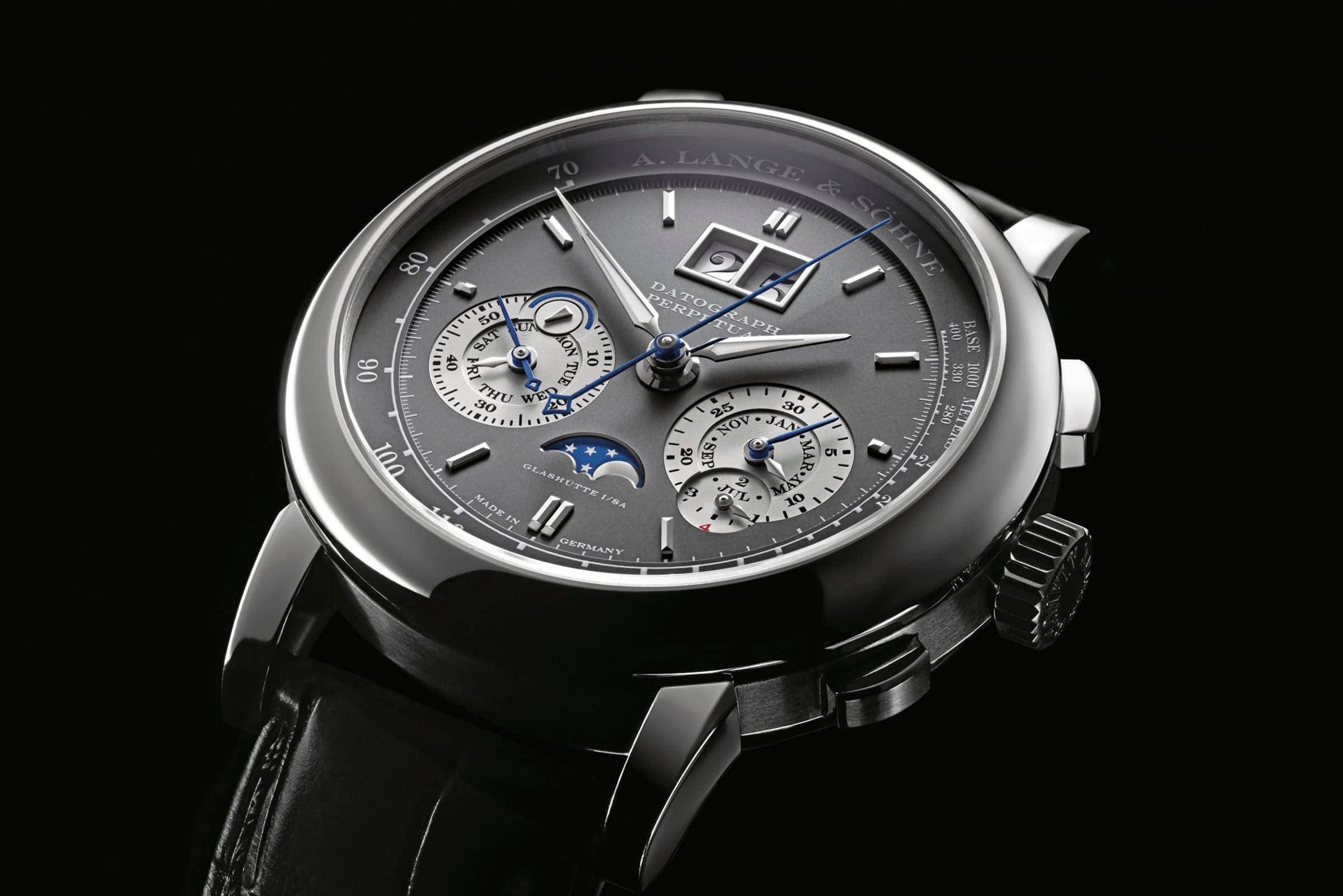
I think a much more useful chronograph feature by far would be a big-numeral counter for capturing elapsed time well beyond the 12-hour mark. What comes to mind is the aesthetic of an A. Lange & Söhne Datograph Perpetual except the digital display is for the chronograph, not the date. If chronographs are useless but we still enjoy them, why haven’t any watchmakers taken the function out to the conceptual extreme? Attach a day counter to a chronograph. Presumably, if the watch has a perpetual calendar as well, it should always be running. So allow someone to time not merely half a day but perhaps even an entire trip to Morocco.
I could see a function like this fitting incredibly well into a regatta-style watch, allowing its wearer to time multiple days at sea. If we’re taking watches to the extremes in the 2020s, I don’t see why the chronograph should be left behind.
Ultimate uselessness
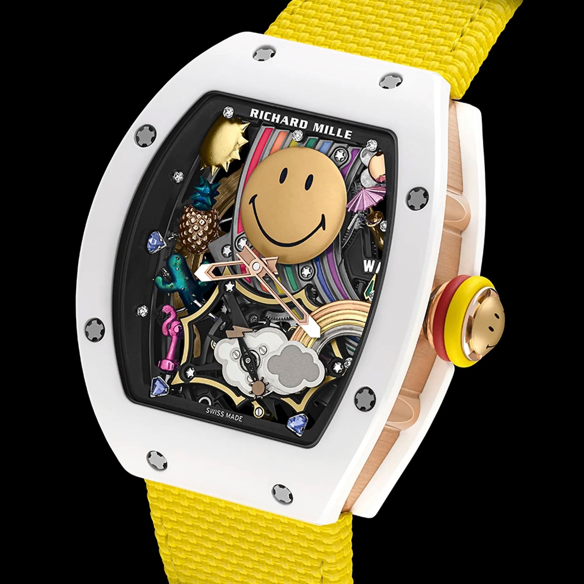
And while we’re at it, why doesn’t a company like Richard Mille take a concept like its RM88 Tourbillon Smiley to its perceivable extremes and incorporate all of it — perpetual calendar, rattrapante chronograph with day counter, etc. — into a watch that’s all art and not legible at all? If Rolex, the king of tradition, decided it was time to exchange the day and date for feelings and emojis, the rest of the industry is certainly behind the absurd times. Let’s make chronographs useless. Then maybe I’ll buy one.
How obvious do you want your chronograph’s uselessness to be? Let us know in the comments.

