Hands-On With The Beaufort Pulsatimer — A Brawny Blend Of Retro Delights And Tool Vibes
I’m all for a tough sports watch with a muscular design accompanied by a matte black or blue dial, a solid depth rating, and big, blocky lume-printed indices. But the Beaufort Pulsatimer is a conflicting mix of this and dressy vintage, and it frazzled my watch-brain neurons.
I have a confession to make: sometimes a watch gets unboxed in my office and elicits an immediate frown. This is because I still have preconceptions, even after writing about watches for more than five years. And the Beaufort Pulsatimer just didn’t fit my idea of a sports chronograph, so I put it back in the box and enjoyed the Seatrekker that came along with it.
The second Beaufort and its contrasting nature
About a month ago, I received two watches for review from Beaufort in New Zealand. Judging by these very different timepieces, the brand is building up a diverse portfolio. And it turns out that both the Seatrekker and Pulsatimer have that rare quality of flipping a first impression and growing on me. That’s more valuable than love at first sight as instant perfection fades way more quickly than a design that takes time to sink in. The Pulsatimer is an unlikely blend of mid-century elegance and the tough stance of a steel sports chronograph. Does it work?
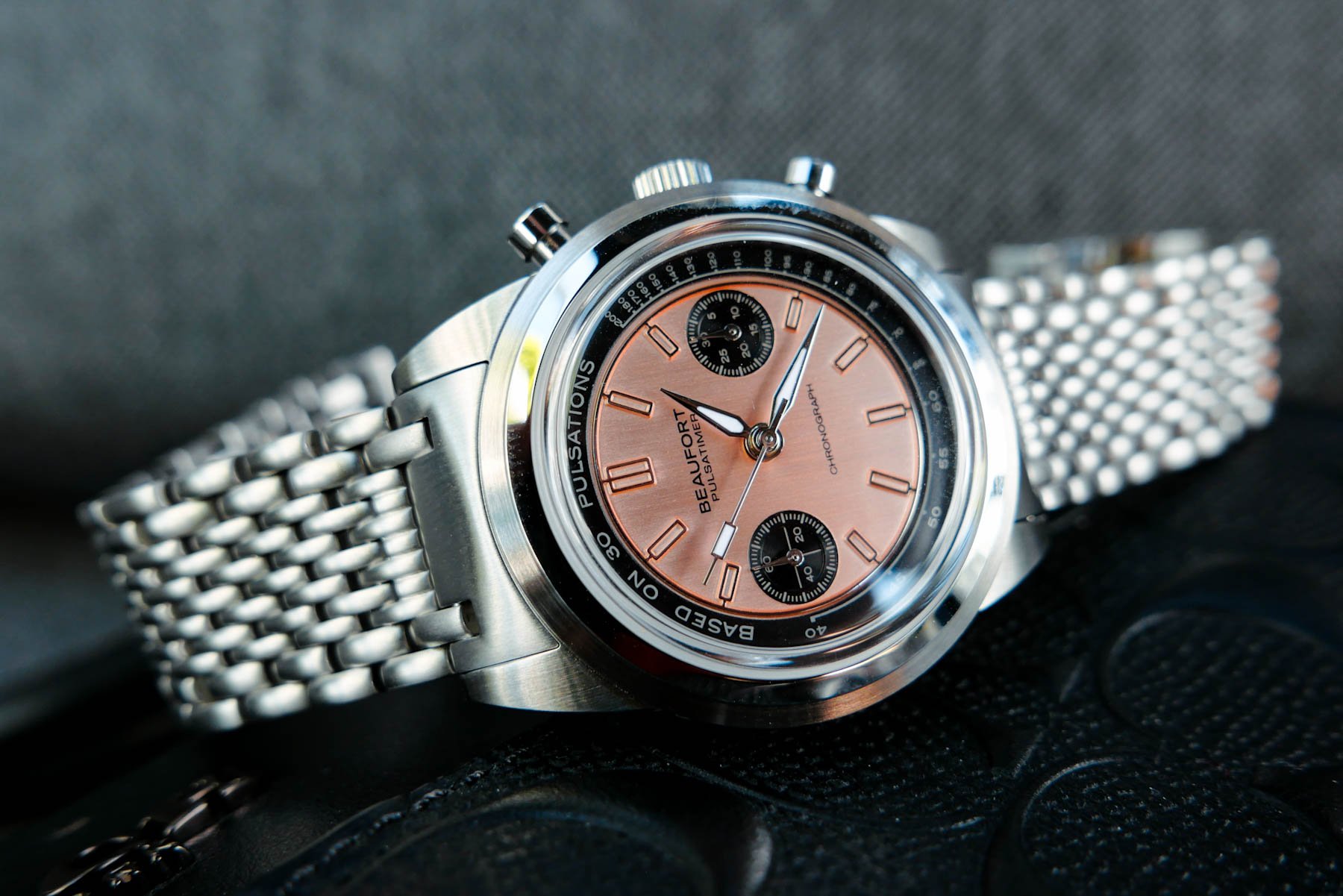
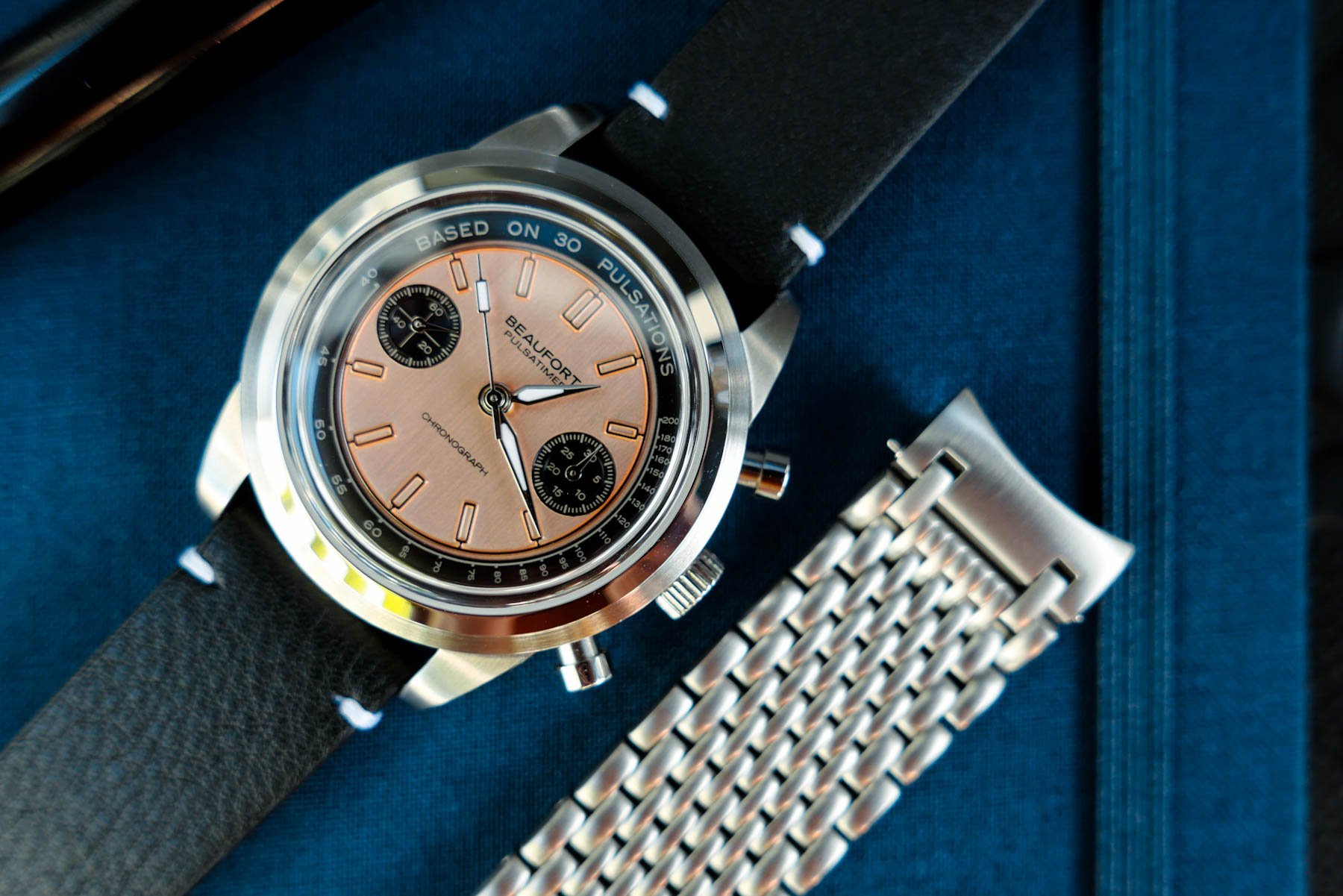
Looking at the Beaufort Pulsatimer, it genuinely felt like someone had transplanted the dressy dial of a 35mm vintage watch into a modern sports watch with a thick, beefy case. It also came on a very odd-feeling alternative beads-of-rice bracelet, while the standard leather two-stitch strap was hiding in the box. Ironically, this strap conundrum was in exact opposition to my impression of the Beaufort Seatrekker a few weeks ago. I will be perfectly honest and admit to not feeling the vibe of the BOR bracelet with its large, plain end link, so I put the watch back in its box with a frown on my face.
Conflicting first and second impressions
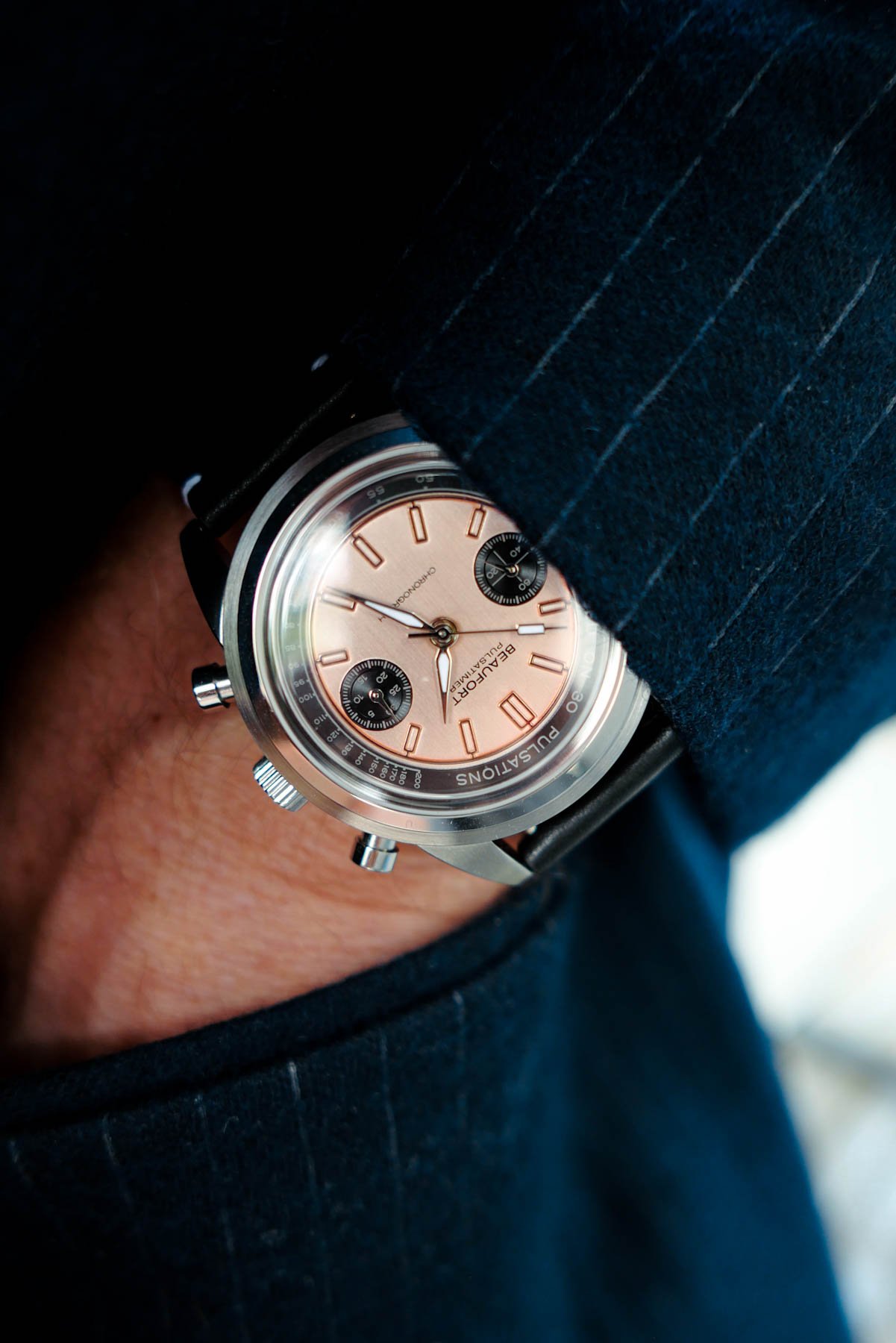
Fast-forward a couple of weeks to when I got the Pulsatimer out of its box for the second time and noticed the thick, high-quality two-stitch leather strap. As it turns out, this is the standard offering, while the beads-of-rice bracelet is an optional extra. That’s good because the bracelet is just too much for me. It has an all-brushed finish and might work perfectly on the dive-cool Seatrekker. But with its massive solid end links, it was a tool step too far for the Pulsatimer. It clicked as I took the tool-tastic bracelet off and viewed the watch in its pure, strapless state. Checking its stats on the Beaufort homepage, the idea is that it “bridges the gap between rugged industrialism and refined elegance.” And for once, marketing lingo hit the nail on its 39mm head.
Beaufort Pulsatimer, take two
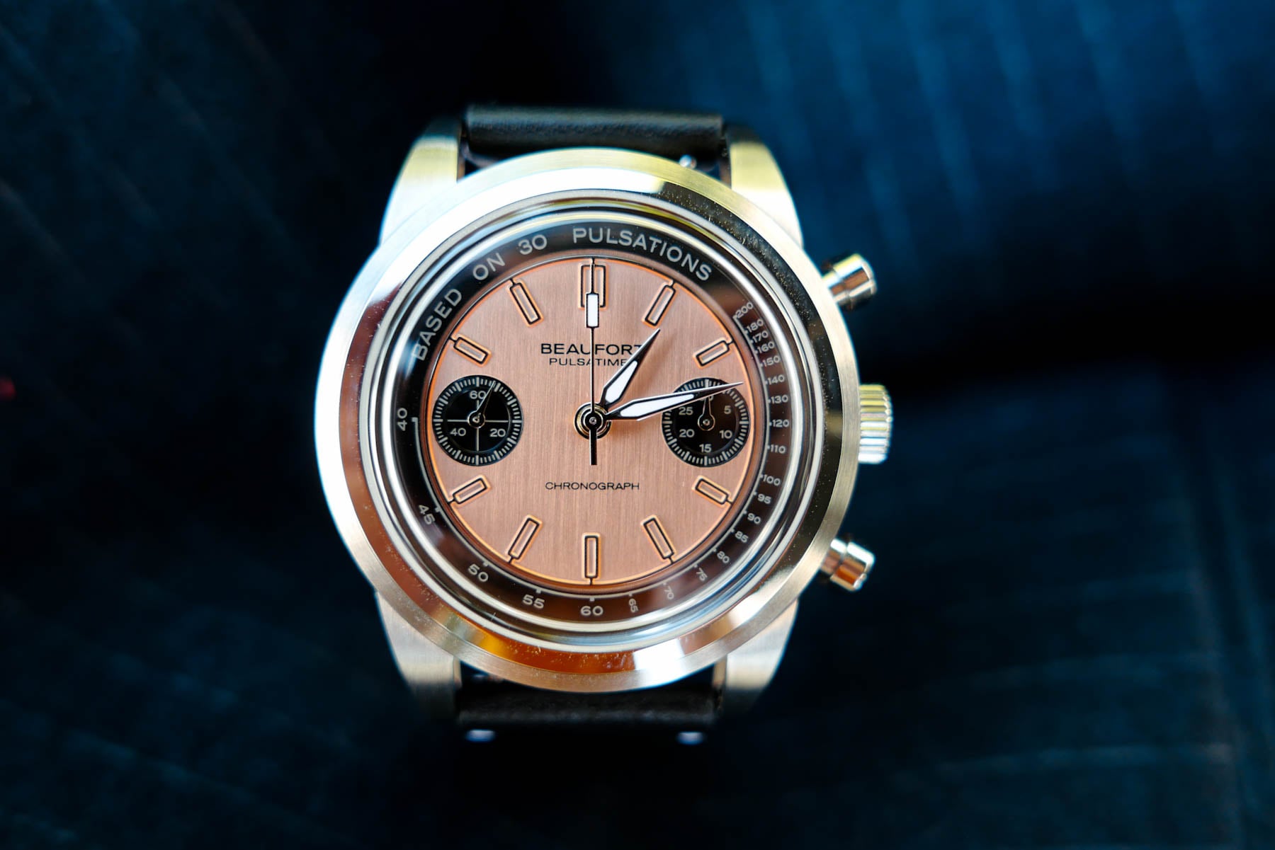
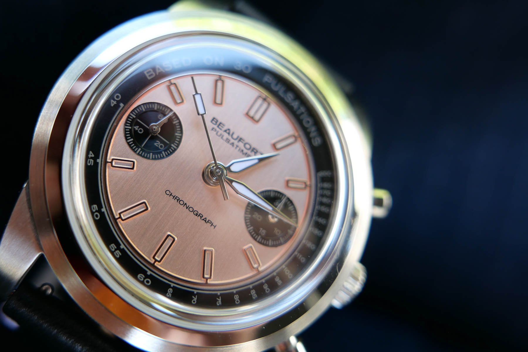
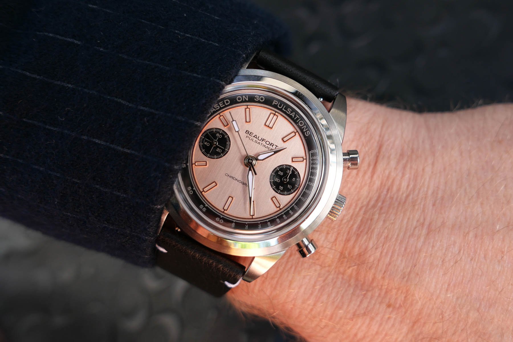
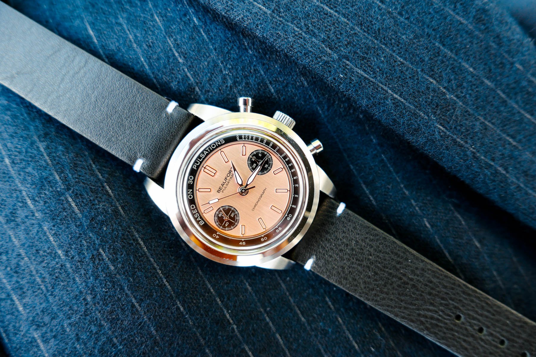
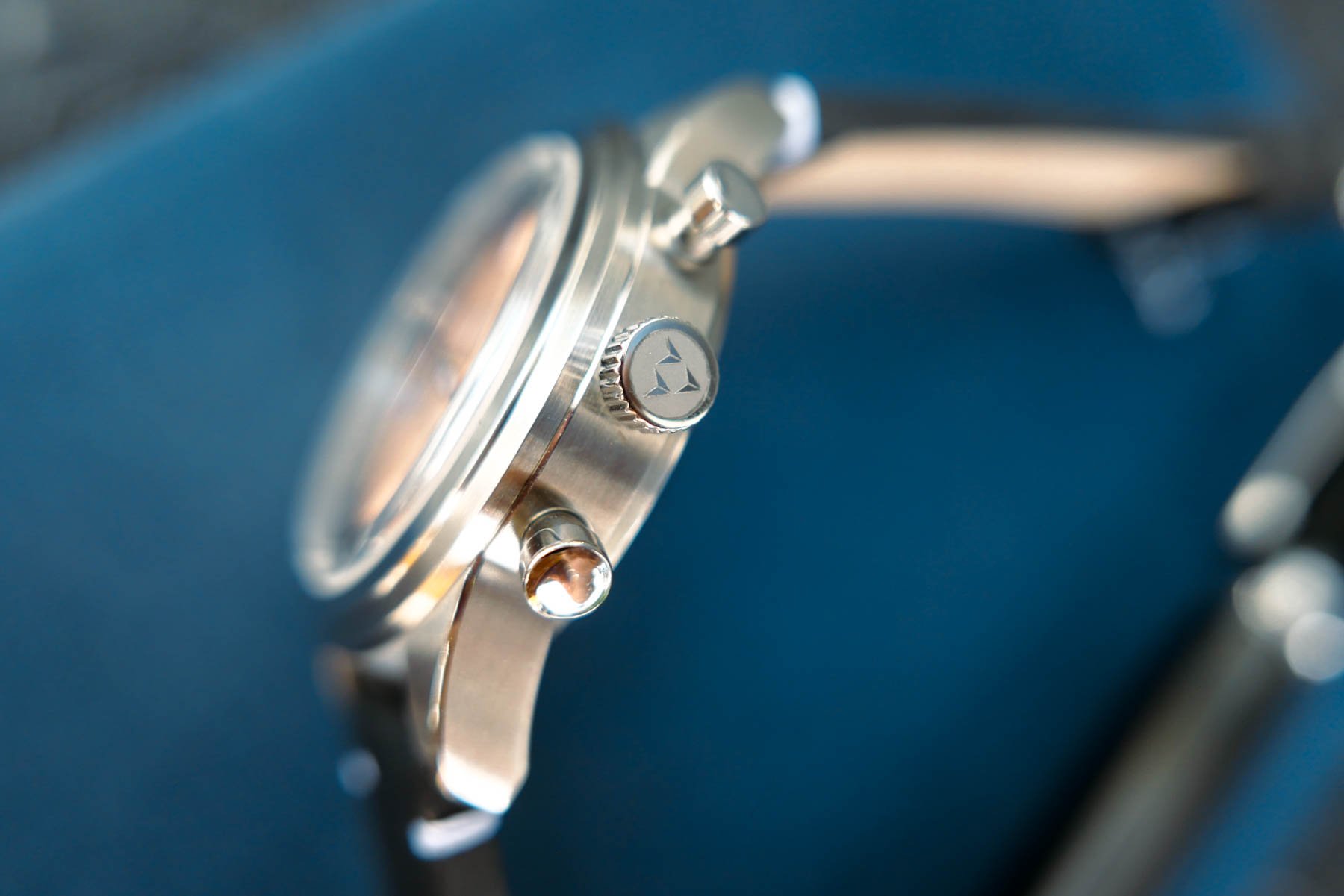
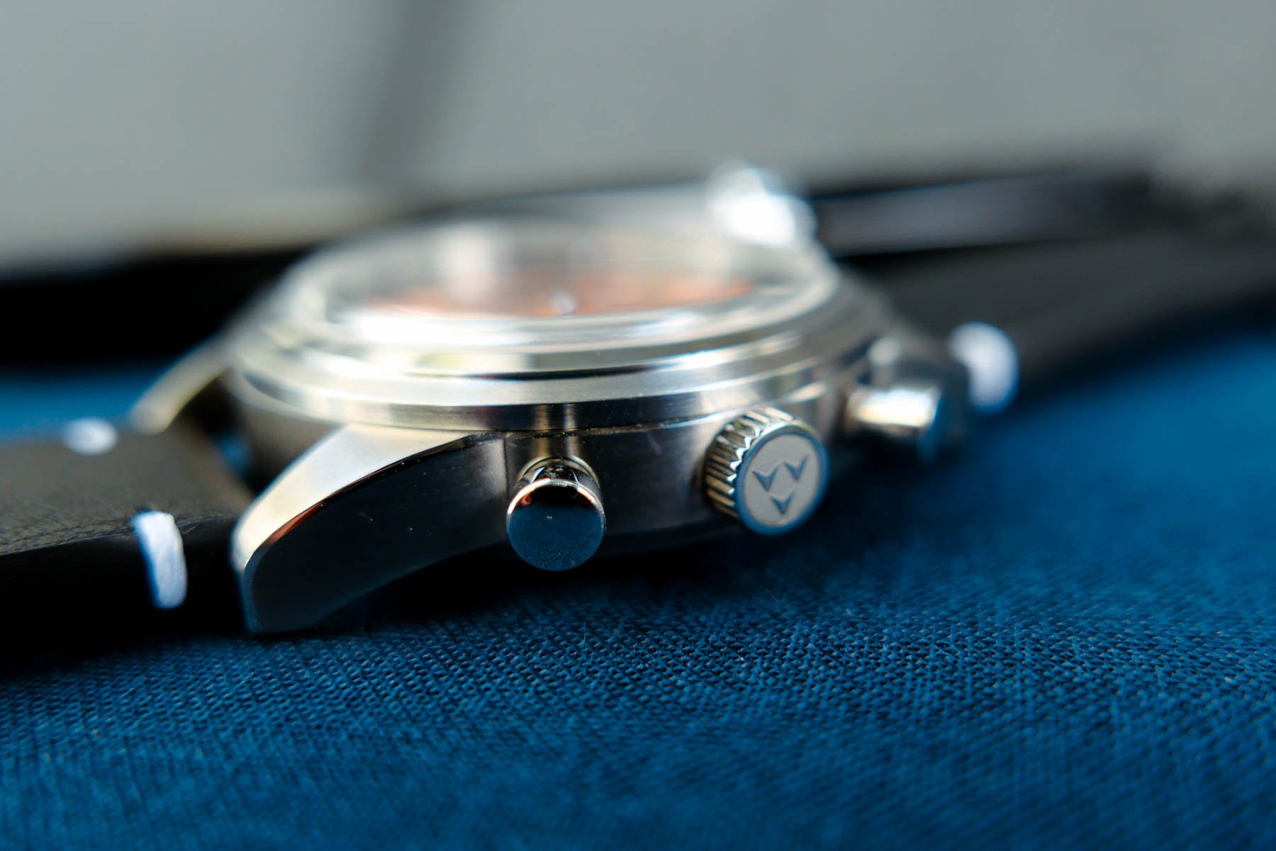
I distinctly remember having put the Pulsatimer back in its box, and now I’m wondering whether I was having a bad day. There are a lot of positives to unpack here. The case is 39mm wide and feels more like 40 due to its broad-shouldered design. The chunky lugs have a great 47mm tip-to-tip span and narrow, polished bevel accentuating their shape. They have also been cut flat under their ends. This is unlike a certain 39mm Black Bay, on which the lugs end in a razor-sharp tip (not a compliment). But my favorite case detail is the accomplished design of the stepped bezel. It exhibits a broad, sloping top framing a domed box-style sapphire crystal. This polished detail matches twin steel pushers flanking a screw-in crown with an engraved logo. All this leads the eye up to a contrasting and, at first sight, very dressy dial.
When a dial is so wrong yet so right
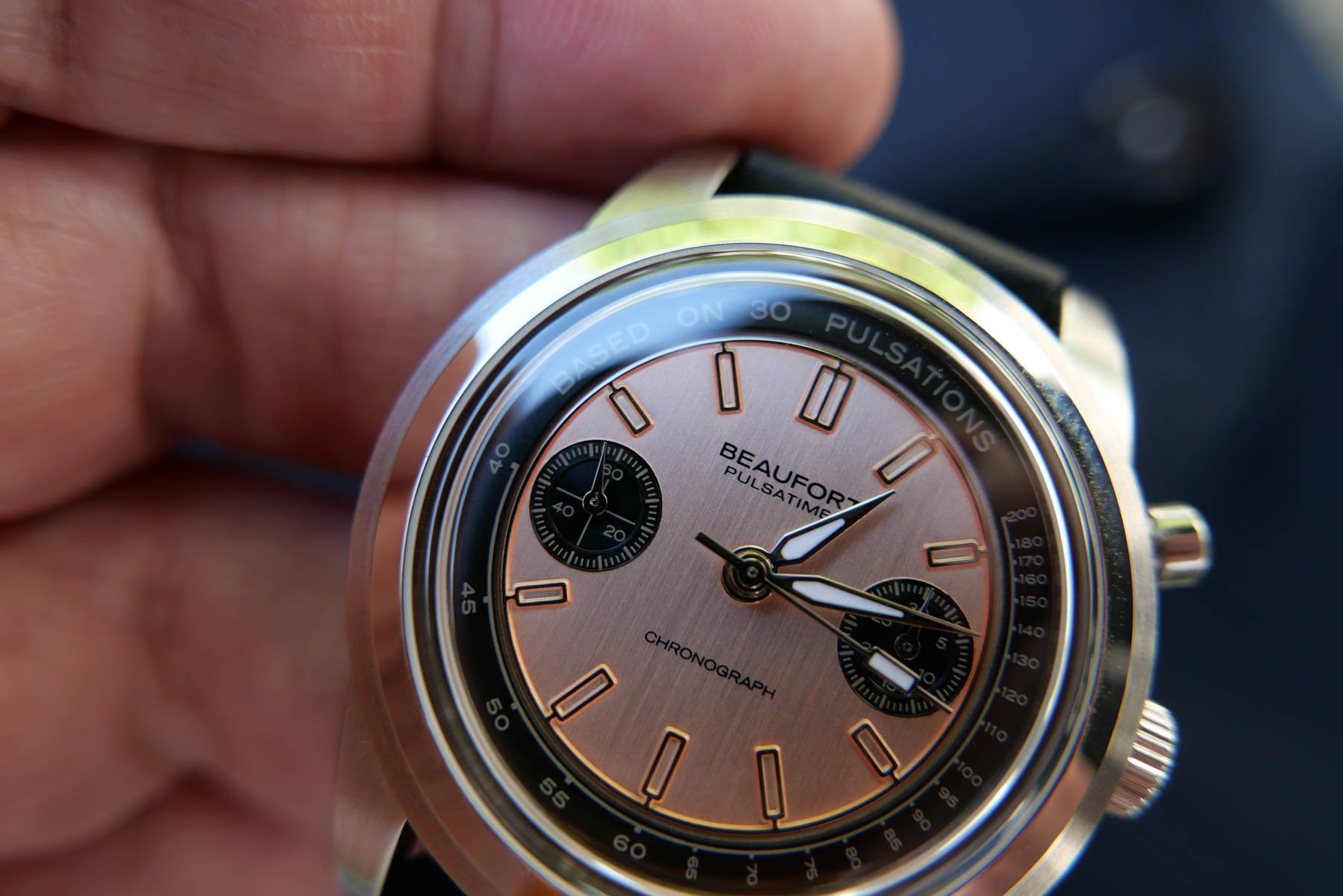
The Beaufort Pulsatimer’s dial has a distinctive vintage touch and feels dressy for its beefed-up case, which measures a not-insubstantial 13.8mm thick (11.9mm without sapphire). I get it if you see the copper-toned brushed dial and expect a thin vintage number. That is what I expected too. But, like the solid build of Grand Seikos, the case is there to ensure solidity, and the Sellita SW510 M BH b isn’t a particularly slim caliber. It also usually powers 41–43mm watches, so Beaufort has done an excellent job fitting it into the 39mm Pulsatimer.
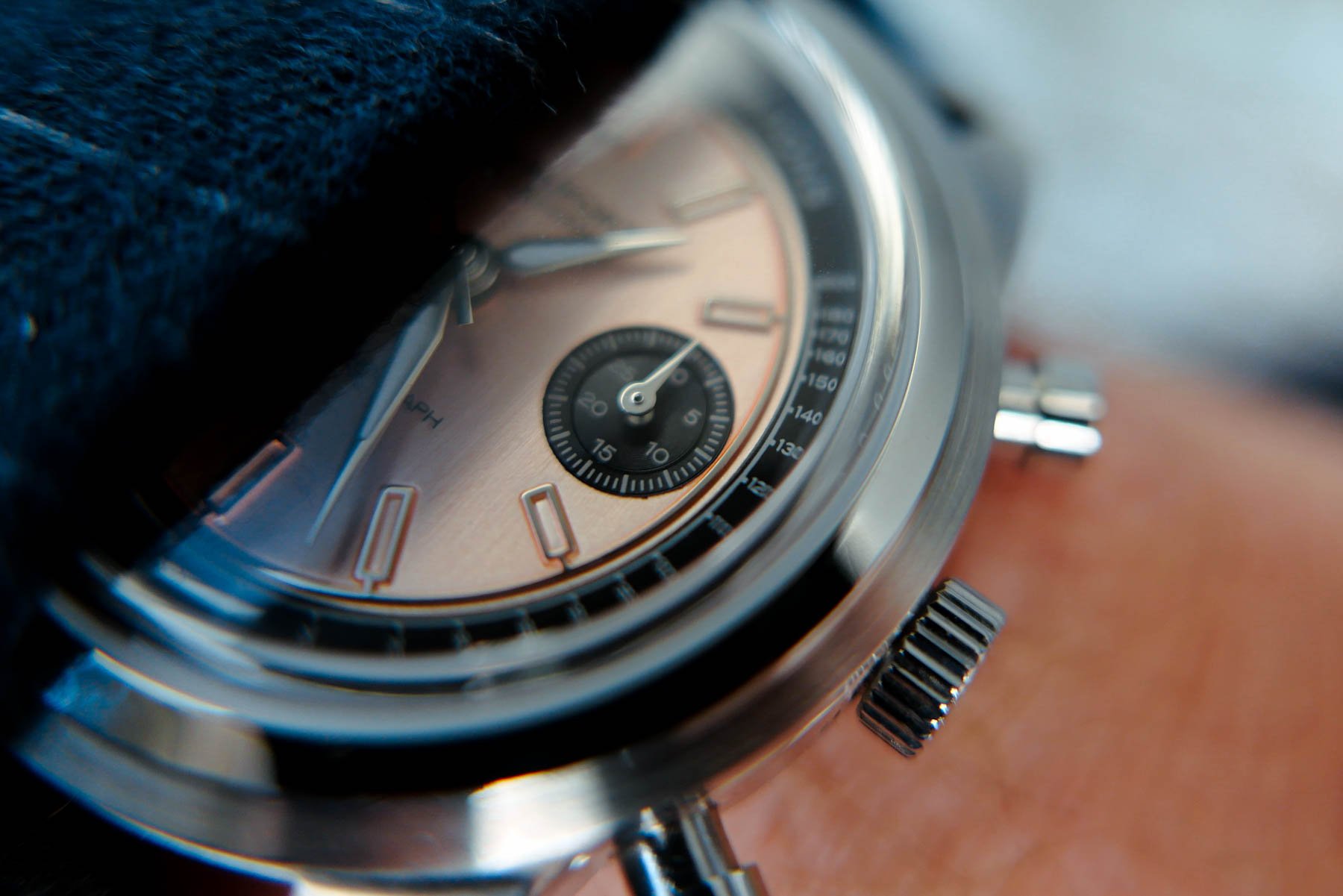
The main dial has twin black sub-dials to match the encircling pulsometer scale. While the two registers are small, they are intricately formed, each featuring a stepped design with a sunray-finished center and a slight angle up to the outer ring with printed markings. A discreet crosshair distinguishes the running seconds at 9 o’clock from the 30-minute counter, and both sub-dials have delicate triangular pointers.
An architectural case
Moving away from the vibrant, vertically brushed salmon dial, I discovered what the solid lug design and Pulsatimer case remind me of. They are similar in shape to my 38mm Credor Phoenix. With that watch’s super-niche appeal, this is purely accidental, but it is a big compliment. And as with every good watch design, the details make all the difference.
I’ve never been a big fan of all-matte cases, and brushed steel needs some polished surfaces to reveal good details. There is a very slim bevel on the lugs, which is just enough to catch the light. It carries on along the case top under the bezel. Add the sloping, polished top to its two-step design, and it all fits together. These seemingly small and non-cost-effective details underline the architectural qualities of the tiered design of the watch head.
New strap, new impression
It’s notable how a strap change can make such a big difference. This reasonably chunky watch case will feel top-heavy on a thin strap. But the standard 3–4mm-thick vintage-looking two-stitch strap has a solid but soft, licorice-like quality. For me, it just happened to be of a perfect length too, and that doesn’t happen very often. My feelings for the Beaufort Pulsatimer changed to the point that it stayed on my wrist for most of the weekend. The studied match of the strap and watch has a lot to do with it. This is something even big brands still fail at sometimes. And no, I did not get into any situations requiring the pulsometer scale, which is good because I still needed to read up on that.
A less confused conclusion
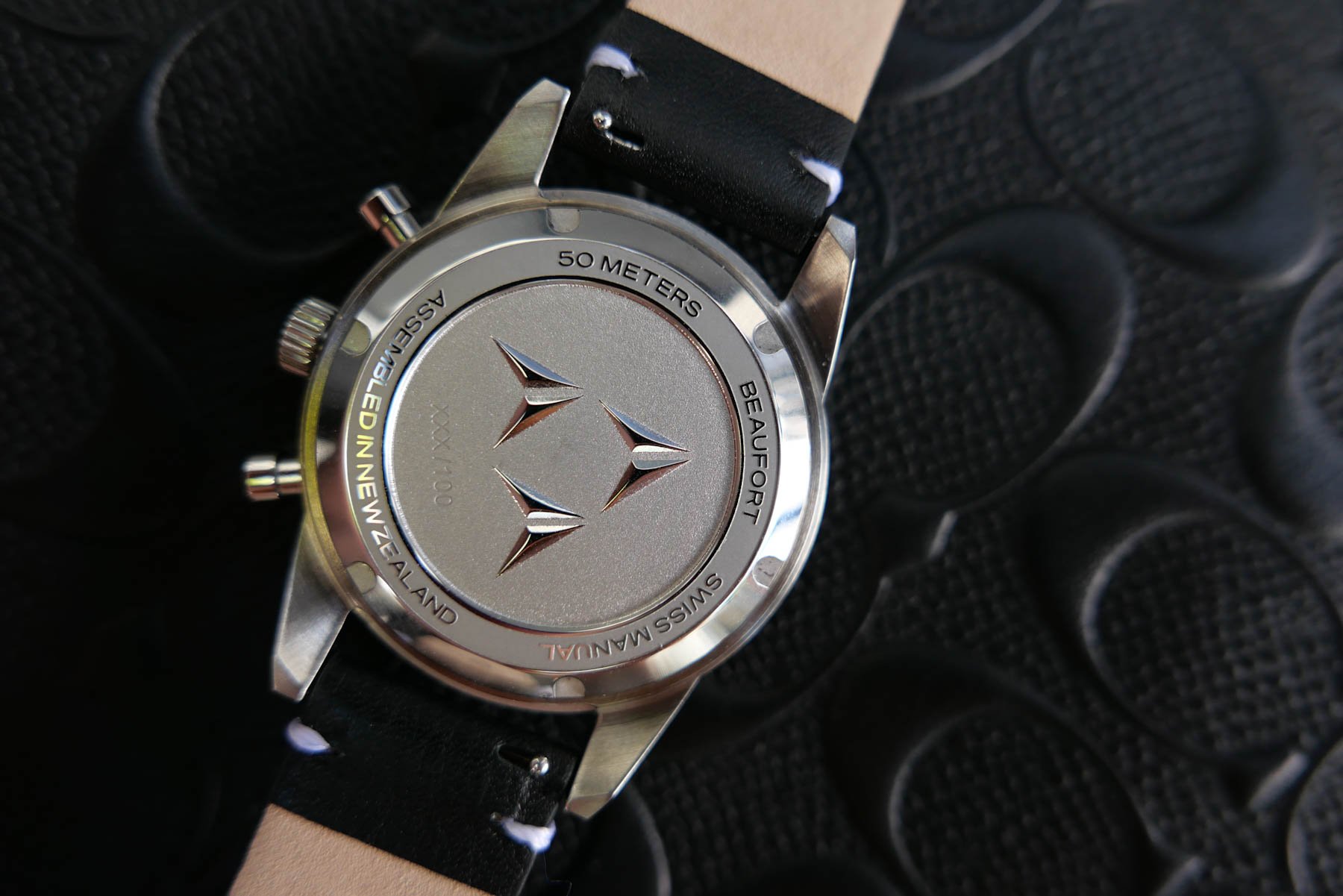
Am I still confused about which era and genre this watch belongs to? Yes, but that is one of the best things about the Beaufort Pulsatimer. It is juxtaposed on a conflicting day in Contrastville. It plays with your style senses and has you wondering which way it leans while you risk growing fond of its slightly schizophrenic nature. And yes, I’m a sucker for a good salmon dial. As for the movement behind the engraved case back, I’ve had a watch with the manual-wind SW510 M BH b before. I find it a solid and accurate caliber with reassuring pusher actuation and a tendency to run a fraction fast.
The chronograph’s central seconds hand and 30-minute pointer snap back to zero perfectly, so all’s good. This Sellita caliber also boasts a 63-hour power reserve, so at NZ$2,370 (roughly €1,203), the Pulsatimer out-bargains a few other vintage-inspired chronographs. This watch is currently available for pre-order with delivery set to commence in September, and all watches will be numbered from 1 to 100. This example is a non-numbered pre-production prototype but is still very well executed. Truth be told, if I hadn’t seen the “xxx/100” engraving, it would have passed as a production piece, even a second-generation one.
So, how do you feel about what juxtaposed styles can do to a watch design? As you’ve read, the Beaufort Pulsatimer threw me into full confusion and then flipped my perceptions. Let me know your thoughts in the comments below.

