Going Hands-On With The Divisive Modern Version Of The Credor Locomotive
The Credor Locomotive is, without a doubt, the most surprising release of the past few months. Credor’s revival of this Gérald Genta-designed classic from the 1970s had people talking. In particular, strong opinions about whether this was a good design or not quickly made the rounds on social media. At first sight, the Locomotive doesn’t seem to make sense. It combines familiar elements from Genta’s other famous designs but mixes them unnaturally. The shapes seem to contrast rather than complement one another. But is there brilliance to the design that needs time to sink in? Is the Locomotive a slow burner that you can grow to love? I had a chance to find out.
For some reason, there seems to be a belief that great designers do not create bad designs. While I firmly believe in the phrase “beauty is in the eye of the beholder,” it doesn’t mean that design cannot be labeled good or bad. If most people consider a design bad for obvious reasons, it is fair to think that the designer made objective missteps. If you have looked into Gérald Genta’s long career, you know that the man created some of the watch industry’s greatest designs. But look past those, and you will find various hits and misses. How does the Credor Locomotive fit into that spectrum? Most people were quick to judge after seeing the pictures of the revived classic.
Does the Locomotive make sense?
In all honesty, I was quick to judge too. At first sight, the design doesn’t seem to make sense. It’s an amalgamation of Genta’s greatest hits that feels off, even silly. But the combination of familiar elements was also intriguing. Since I hold Genta in high regard, I always acknowledge that he might have been onto something. And that “something” isn’t always evident in images online. If there is one thing I’ve learned in my years of writing about watches, it is that to accurately judge one, you must be able to see it and feel it on your wrist.
From the moment we received the watch in the office, there was much more to discuss than just the design. As soon as you pick up the watch, your senses tell you something about its incredible lightness and the beautiful finish of the titanium. Add the stunningly detailed dial, and you will have plenty of visual brilliance to take in. Put it on your wrist and you’ll immediately experience its great comfort. But is that enough to compensate for its oddball looks? I can admit that it wasn’t at first.
The story of the Credor Locomotive
Before I continue describing my experience with the watch, let me provide some context. Henry explained in the introduction article that the Credor Locomotive is a Genta creation that debuted in 1979. The design fits the typical Genta bill of a modern luxury sports watch, even without an integrated bracelet. Genta may be most revered for designing the Audemars Piguet Royal Oak and Patek Philippe Nautilus, and we see plenty of influences from those watches in the Locomotive’s design.
Credor has reintroduced the Locomotive to celebrate the brand’s 50th anniversary. It’s an interesting watch to pick to celebrate this milestone because it wasn’t necessarily commercially successful. It’s been hidden from the wider audience for decades. Because of that, several watch fans accused Credor of jumping on the Genta hype train by reviving this watch. Honestly, I wasn’t aware that the Genta hype train was still running. But regardless of whether opinions were good or bad, this reintroduction surely put Credor in the spotlight for a minute.
Specs and details
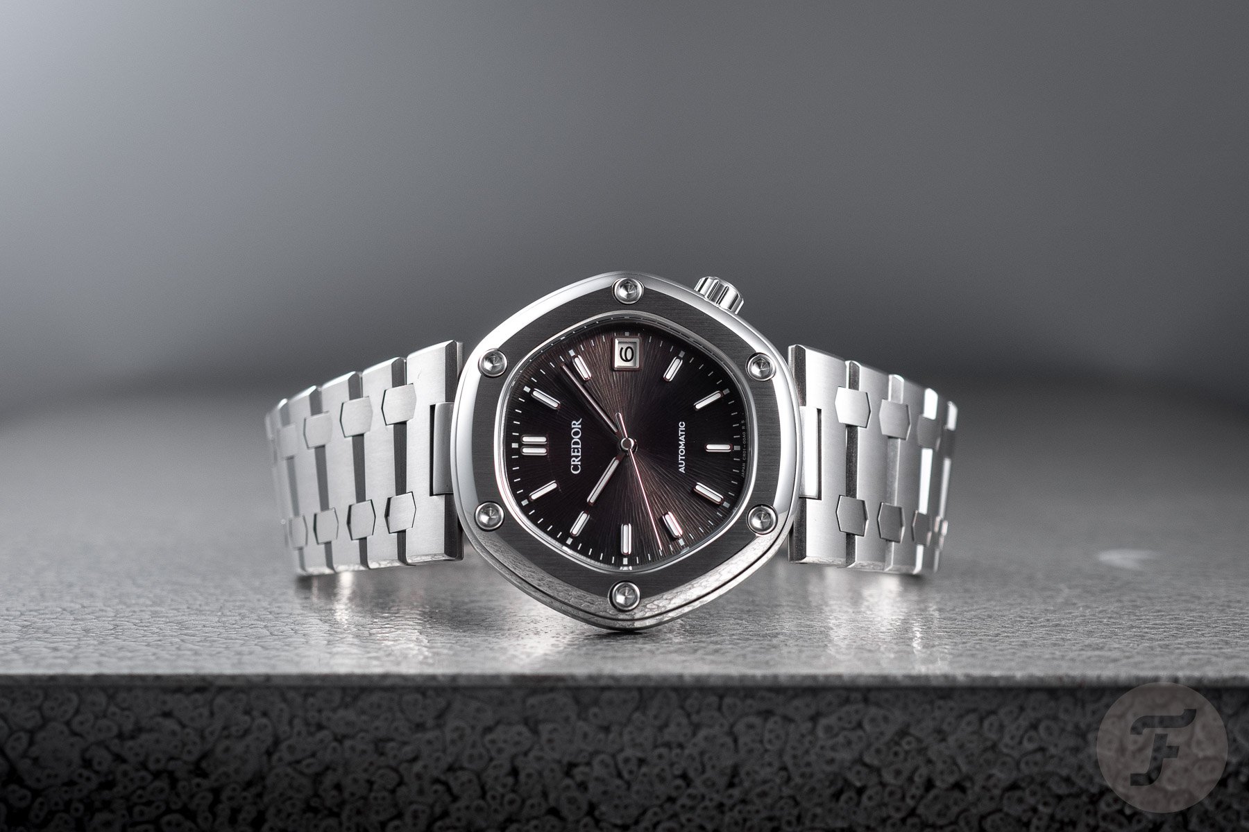
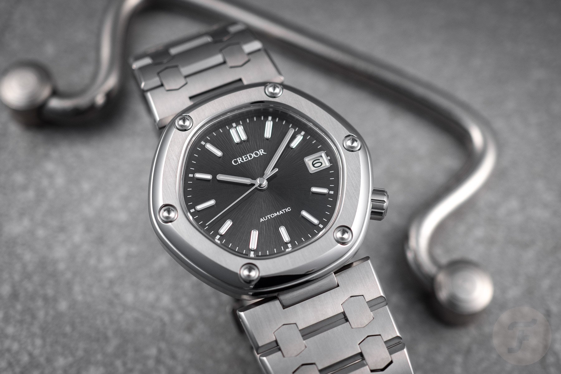
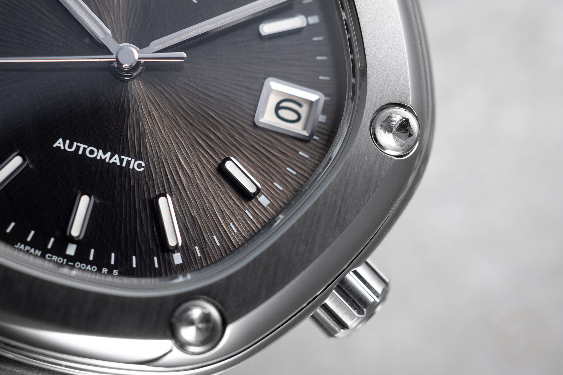
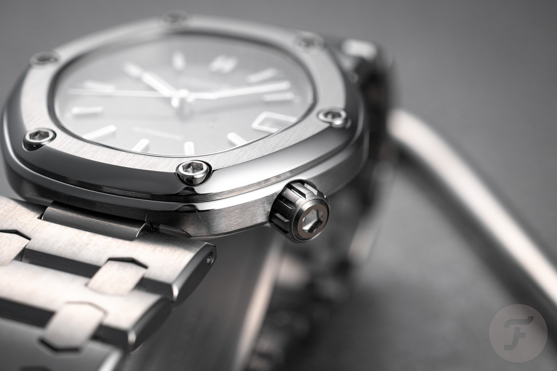
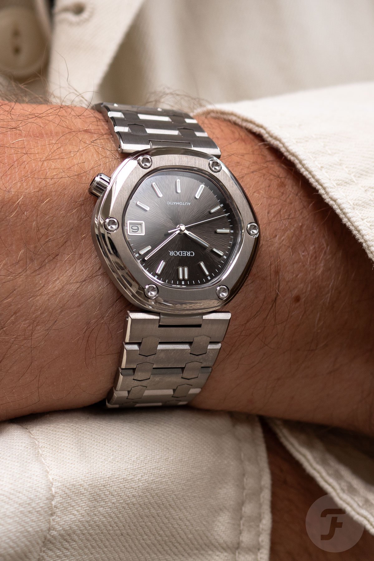
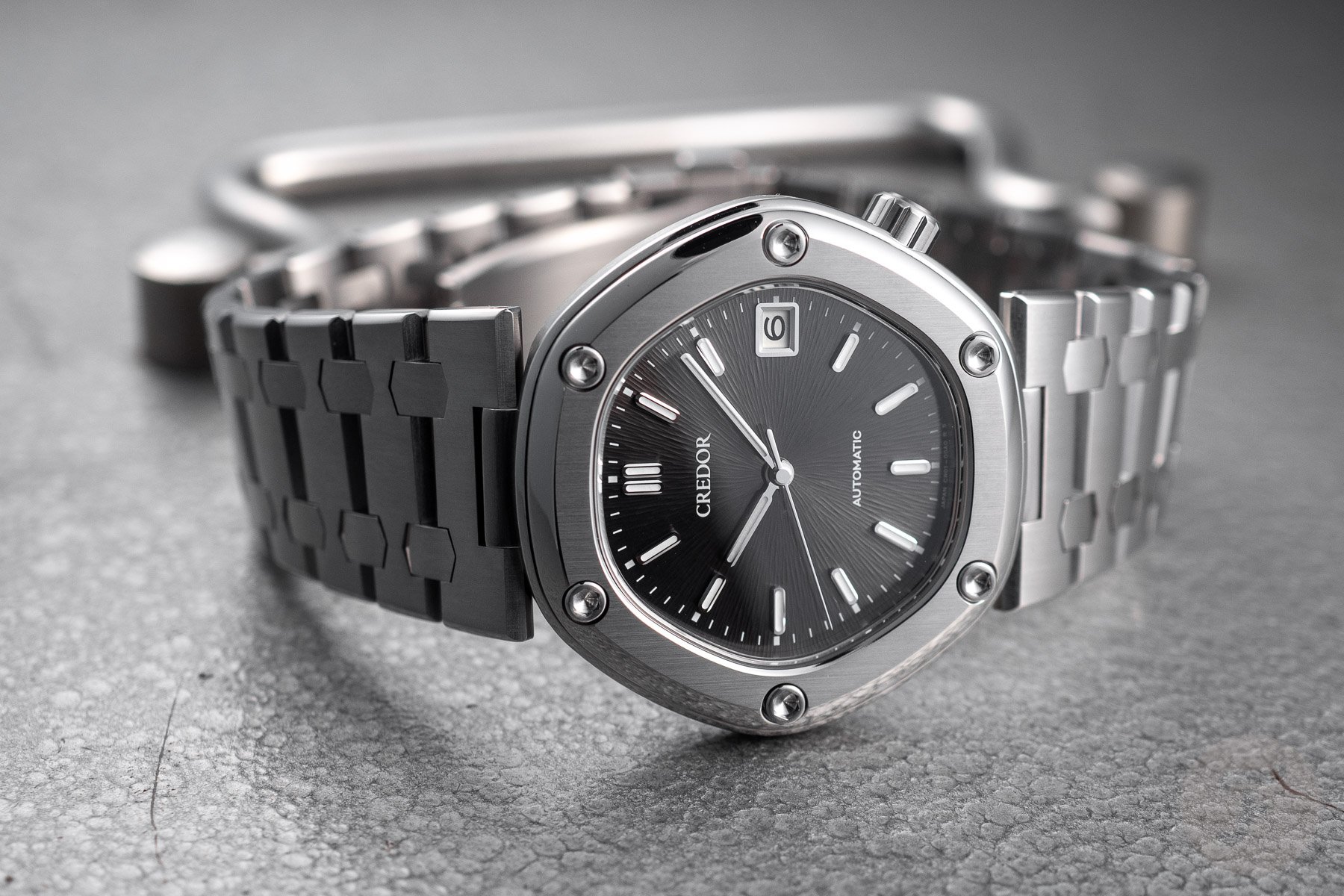
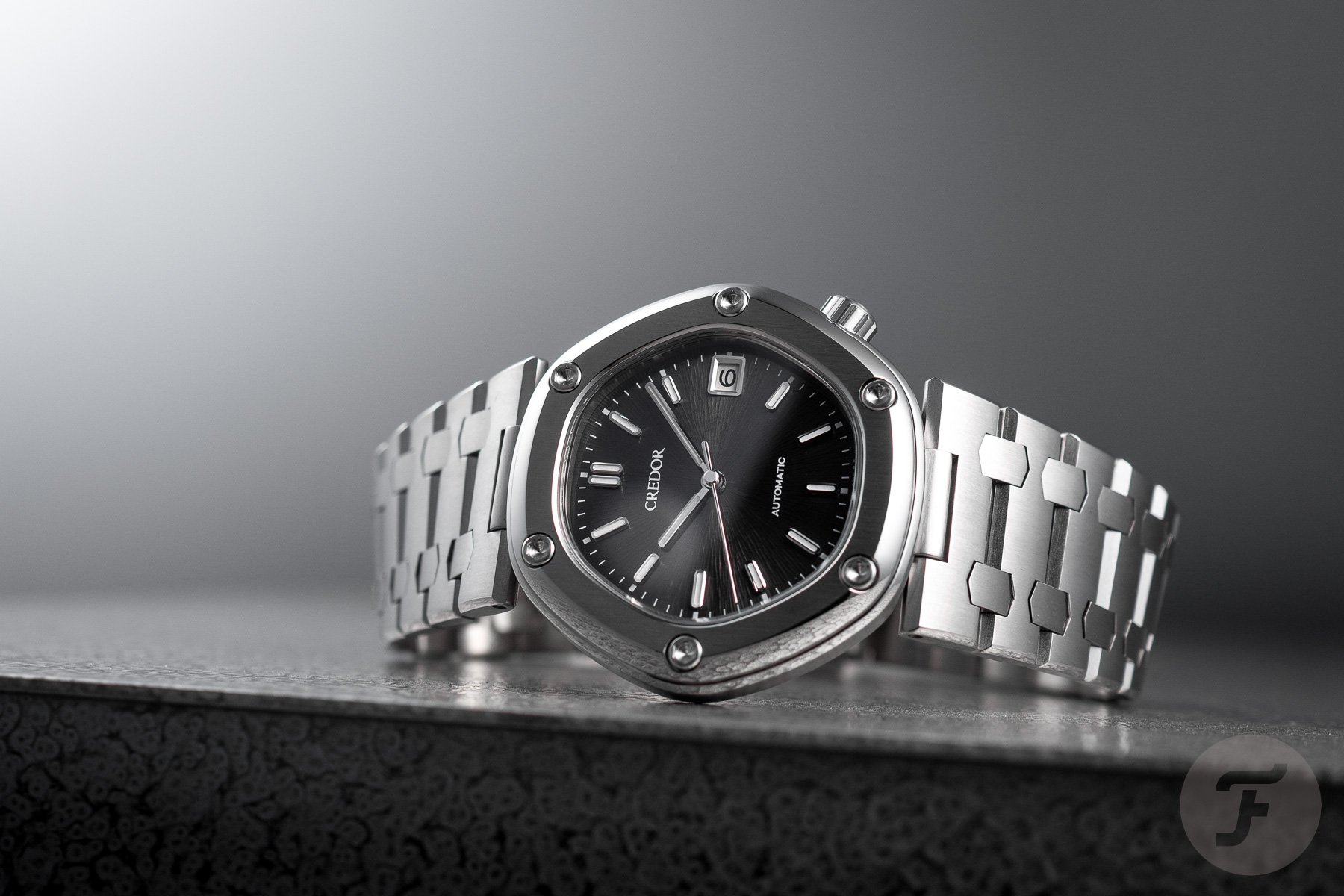
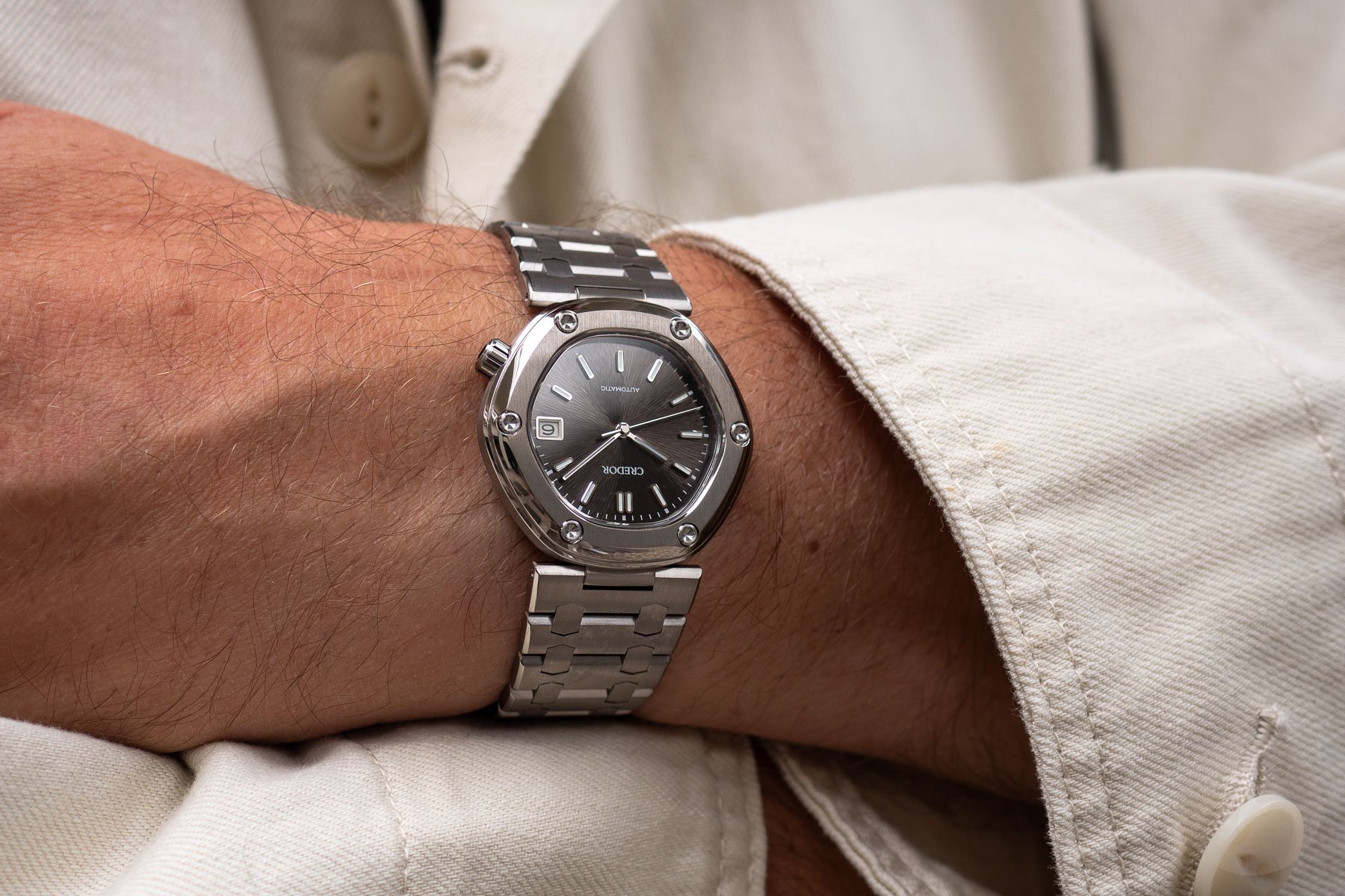
Let’s remind ourselves of the particulars of the new Locomotive and how it differs from the original version. First, the watch has a 38.8mm high-intensity titanium case that measures 41.7mm long and only 8.9mm thick. This hexagonal case with its characteristic hex-socket bezel screws features a screw-down crown at 4 o’clock with a similar socket design. It is also water resistant to 100 meters.
Due to the case and bracelet’s titanium construction, the watch only weighs 78 grams. However, because we had a dummy without a movement sent to us, the watch felt even lighter. It was a bit misleading, but it still gave us a good idea of how light the watch is.
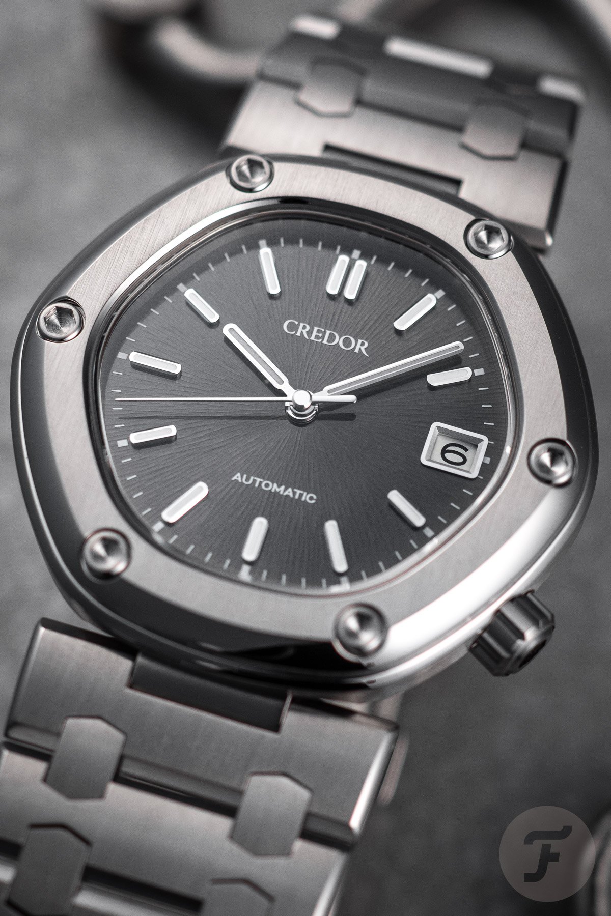
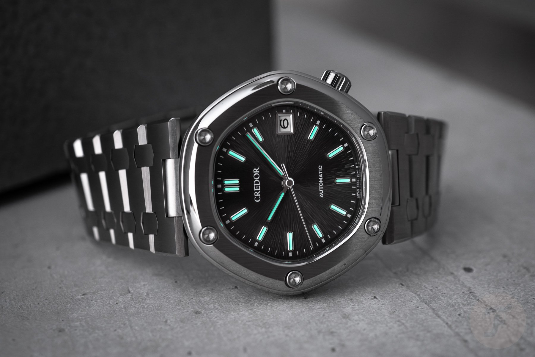
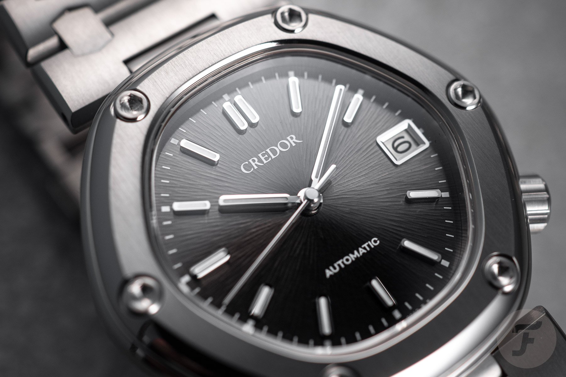
The beautifully finished case is combined with a spectacular dial. As Henry explained, this backdrop features 1,600 radial lines that look stunning in real life. They work together incredibly well with the color of the dial. Credor might claim that it’s a black dial, but it changes color in different lighting, going from black to dark gray to almost a dark brown.
It’s an intriguing dial that I found drew me in constantly. At 3 o’clock, you will find a date window that nicely matches the design of the applied hour markers with its polished frame, white date disc, and black numerals.
Addressing the Locomotive’s design quirks
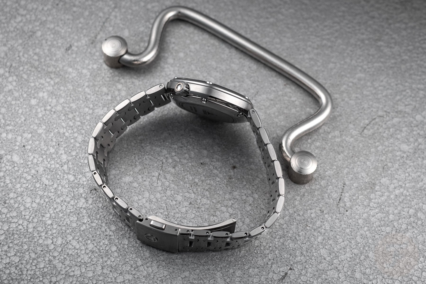
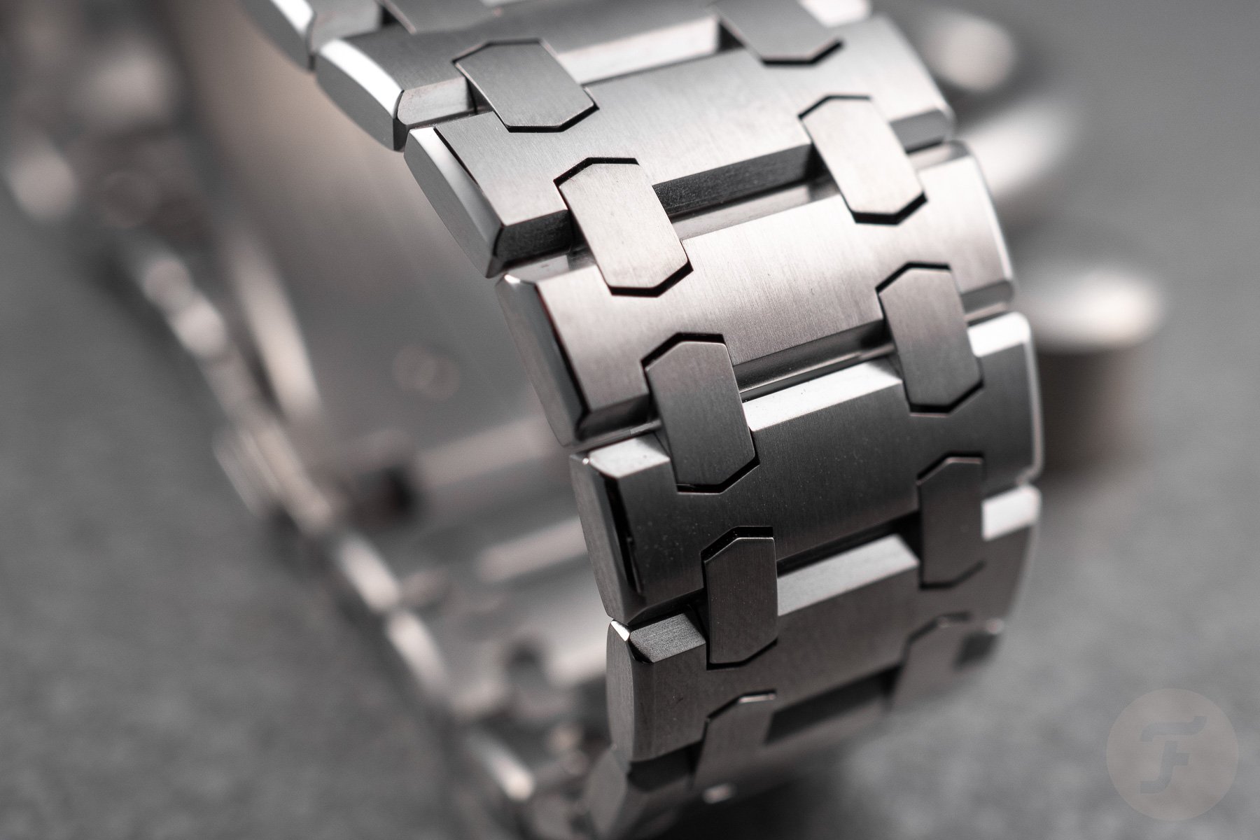
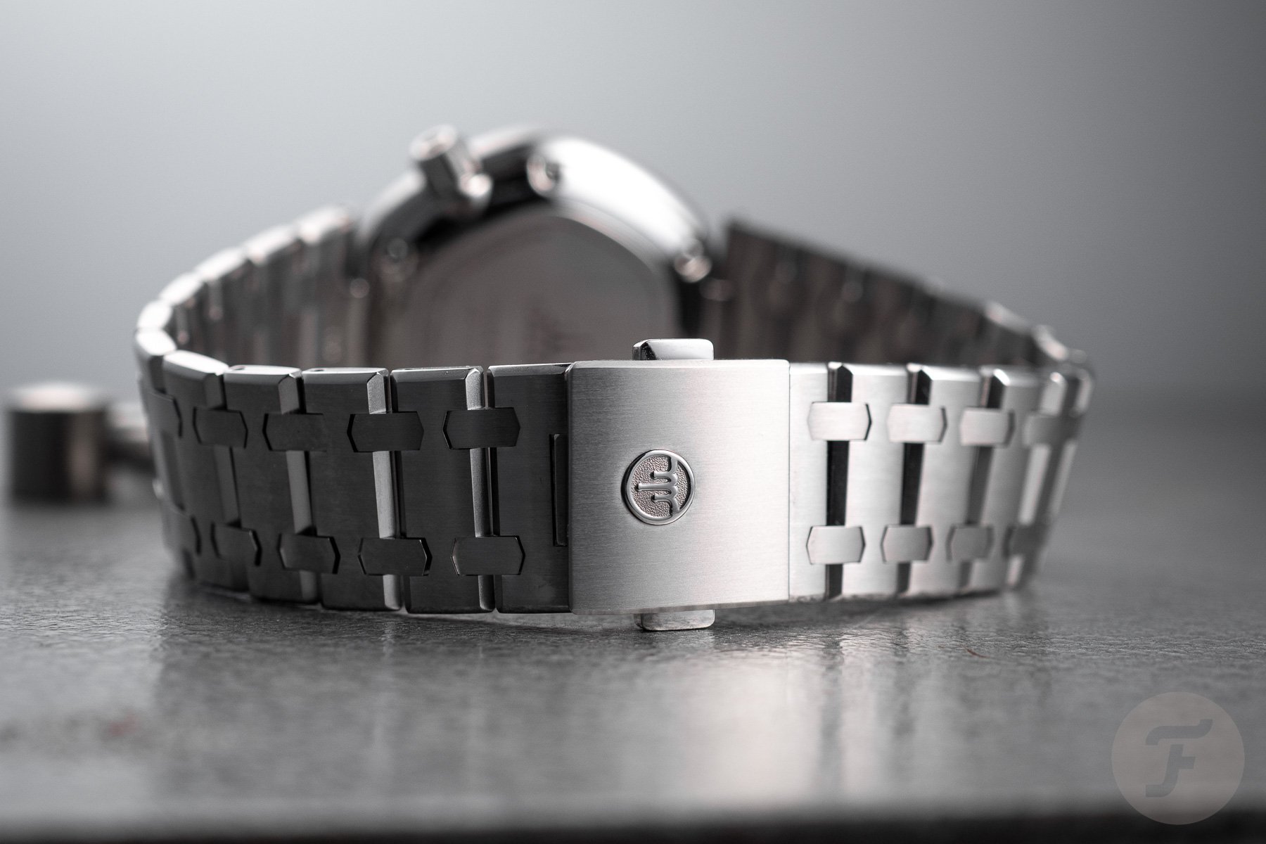
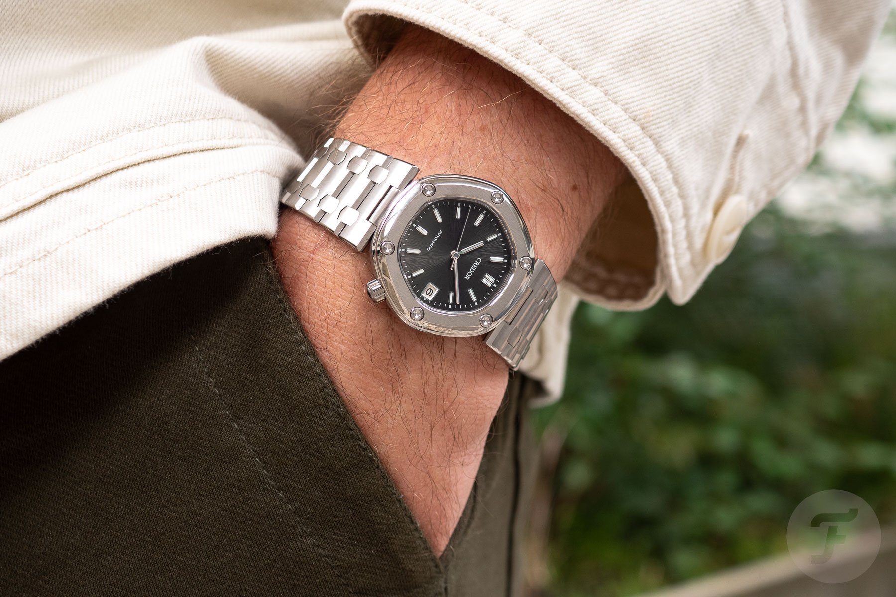
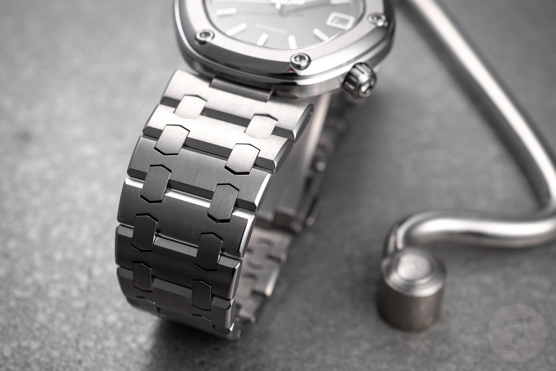
The big discussion points concerning the design are the not-so-integrated bracelet and the hexagonal bezel with its affixing screws. The latter seems a bit unpolished in its appearance because the screws are rather big compared to the bezel width. On top of that, the bezel slopes down towards the case, making the screws stick out. As for the bracelet, it is highly reminiscent of the one from the Royal Oak, but how it connects to the case with a central mounting point prevents it from being integrated.
While that is not an issue in and of itself, this construction may lead you to question this watch’s visual attractiveness. Since there is no natural flow from the case to the bracelet, you may suddenly wonder whether the styles of those elements match or if the bracelet is too wide for the case.
Overall, you could question whether we are not looking at a patchwork design with elements of the AP Royal Oak (bracelet), the Chopard Alpine Eagle (dial texture), and the Cartier Pasha (central mounting of the bracelet). I would even suggest some similarity with the dial design of the Patek Nautilus. However, the big question is whether this combination of elements works.
Wearing the new Credor Locomotive
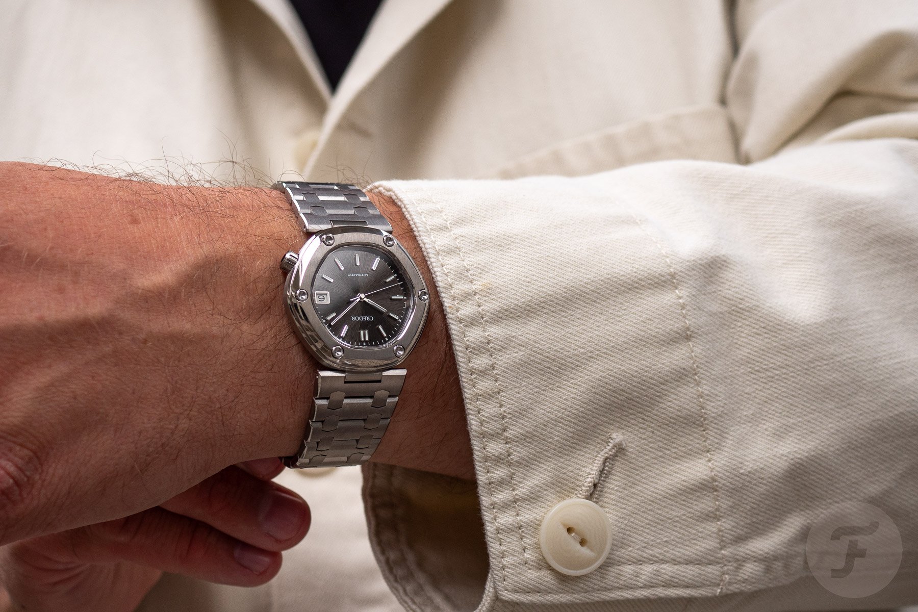
The first time I put the Locomotive on my wrist, I was mostly in awe of the watch’s lightness. Granted, the dummy didn’t feature the newly developed thin CR01 movement. That automatic caliber will power all 300 units of this watch, beat at a 28,800vph frequency, and offer a 45-hour power reserve.
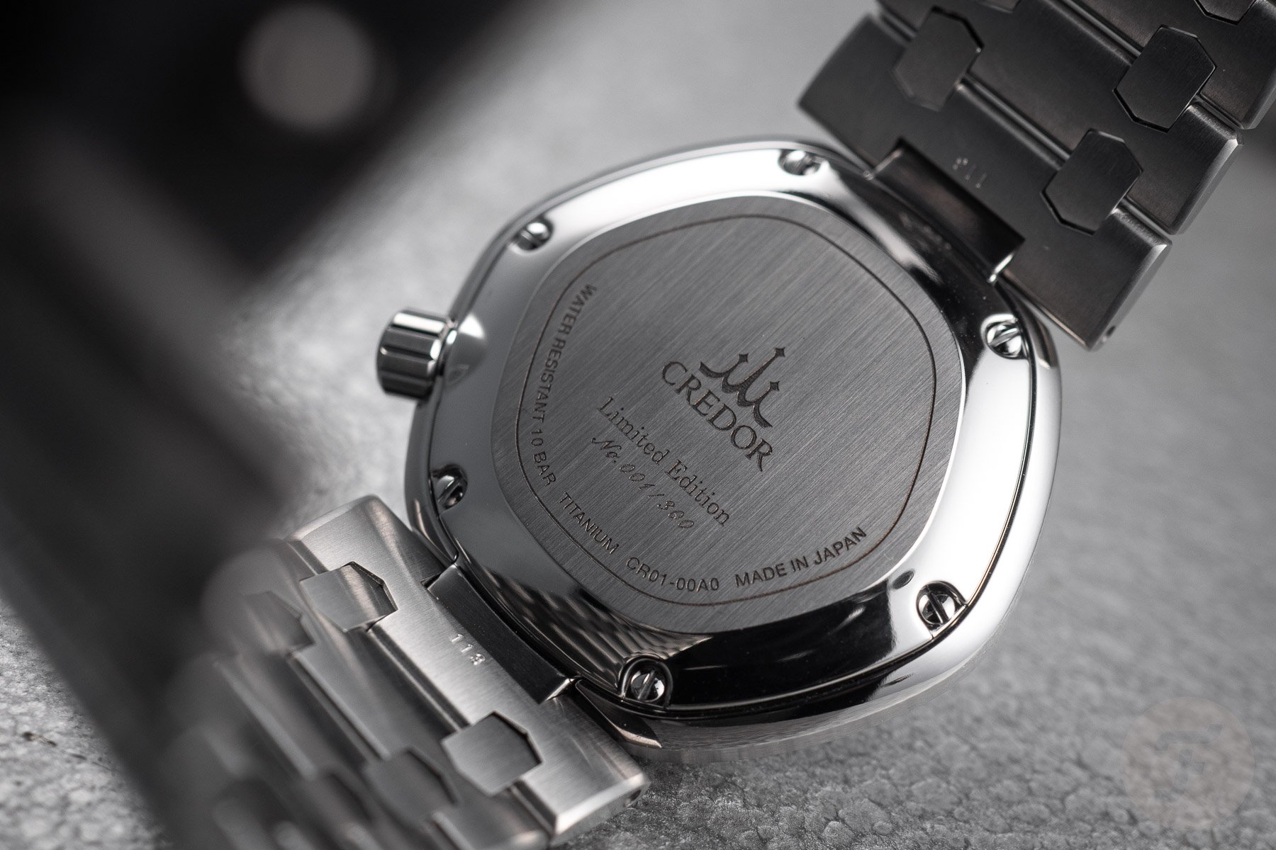
Not having movement in the watch reduced the weight from 78 to 64 grams, so it made a difference. But even with the movement, it will still be a super light piece. The movement will be hidden behind the titanium case back, which is affixed with six screws and has each watch’s LE number engraved.
After getting over the lightness, I was super impressed by how well the watch was finished. The combination of brushed and polished parts creates a beautiful contrast. In terms of visual presence, the metal resembled stainless steel. It has a crispness that we usually do not see with titanium watches, and that drew my eyes back to watch constantly. I found so many intricate details that stood out once the watch was on my wrist. It was pretty incredible.
The Credor Locomotive is a slow burner
But the bigger question, of course, is whether the design makes sense. Are the design quirks problematic, or do they become the main attraction? It took me some time to get used to the design, but once it clicked for me, I quickly became a fan. On the wrist, the watch’s proportions do make sense. I mean, how could they not?
Genta surely knew what he was doing, and he was exceptional at finding the right proportions for his designs. It’s evident to me that Genta focused on making this design work on the wrist. All too often, we judge the proverbial book by its cover. In all fairness, the cover of this book is slightly misleading.
I ended up adoring the new Credor Locomotive. But I also understand that it fits into my recent fascination for quirky, not-so-typical designs. Good examples are the excitement I felt when I saw the Toledano & Chan B/1 and the brilliant Audemars Piguet [RE]Master02 Selfwinding. Additionally, I have an ever-growing infatuation with gold Piaget bracelet watches. They immediately stand out, but they’re certainly not for everyone. That’s also how I feel about the new Credor Locomotive. Gérald Genta created some exceptional designs that have become industry icons. If those are what you’re into, they are what you should pursue.
Final thoughts on the Credor Locomotive
However, if you’re up for a visual roller-coaster ride that feels strangely familiar at first but wild and wonderful once you surrender to Genta’s eye for design, you will have an absolute blast wearing this Credor Locomotive. I did for the short time we had it in the office. Would I change anything about it? I most certainly would not. Well, maybe a high-end quartz movement would have been truer to the original, and I know Credor wouldn’t have had trouble finding one. But I also understand the bigger appeal of a mechanical movement to the people who will have to pay €14,000 to buy the new Credor Locomotive.
This revived Genta creation is not for everyone, and Credor understands that. This is why the brand will only create 300 units of the new Locomotive. To me, the watch is a testament to Genta’s quest to design watches using rudimentary shapes. After tackling the octagon, square, and circle through the Royal Oak, Nautilus, and Ingenieur, he also successfully created a hexagonal design with the Locomotive.
If you can get on board with the remarkable design choices he made along the way, it’s worth checking the new Credor Locomotive out. Despite the reservations I had in the beginning, the watch completely won me over through Genta’s standout design and Credor’s brilliant execution of it. The combination of the two makes this one of my favorite releases of this year.
All 300 pieces of the Credor Locomotive will be sold through select retail locations. In Europe, the watch will be available exclusively through Grand Seiko’s boutique at the Place Vendôme in Paris. If you want to find out more, visit the official Credor website.

